The working example we’ve been looking at up to this point is published on RueTattoo.com (How Much Does Tattoo Removal Hurt?). You can review the published post as you move through this lesson.
VERY Important Note: Shortly before we published this training, WordPress dramatically redesigned their visual page and post editor, so your screens won’t quite match up with those in this training by default.
You can switch back to WordPress’ “classic editor” very easily, which will make all of your screens when drafting pages or posts on your website match up with those within this training.
Just search the internet using a phrase along the lines of “how to change back to WordPress classic editor” and you should be able to find multiple articles and videos that will walk you through this process step-by-step in less than five minutes.
Tips on Formatting Blog Posts
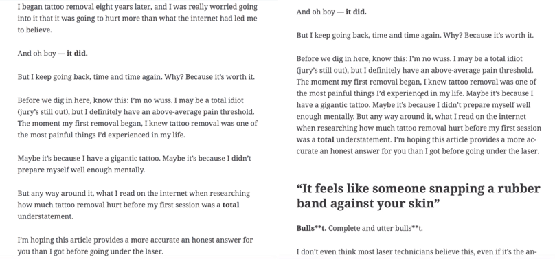
Break up your paragraphs into smaller chunks. The following images show how overwhelming large paragraphs can be:

Broken-up text (left) versus wall of text (right)
Note that the broken-up text on the left is much easier to read and digest than the larger paragraph on the right. Even if the text on the left consumes a larger area, the whitespace between each paragraph is a relief to the eyes.
Use headings and subheadings to create an organized structure. This makes it easier for the reader to skim your article and find the information they wish to read more thoroughly.
Tips on Adding Images to Blog Posts
Avoid inserting images directly above or below headers. Try to place images in between paragraphs or lines of text. You’ll notice in the published post that I moved all images that were below headers or bullet points to areas in between paragraphs of text or removed them entirely when the bullet point was too short to justify the use of an image. Don’t feel the need to add images to every section, particularly if the section is only a couple of sentences long.
If an image doesn’t feel natural, don’t force it. Sometimes an image breaks up the flow of text too much or just doesn’t look right. Feel free to give up on using an image in these instances and opt for the next appropriate spot.
Don’t spend too much time finding the perfect image. If you can’t find the right image for your intended spot relatively quickly, just move on and come back to it at a later time.
Avoid using portrait-oriented images as much as possible because they leave too much awkward white space.

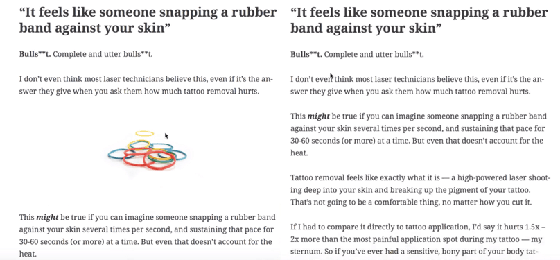
Text with image (left) versus paragraphs of text (right)
Images do a great job of breaking up paragraphs of text. Even though these paragraphs aren’t massive walls of text, it’s still a good user experience to break up the monotony of text.