You have an outline ready and a plain-text editor fired up, but there are some things you need to know before you start writing your online content.
What Should Web Content Look Like?
It seems superficial to be concerned with the appearance of content; however, you need to remember that websites and blogs are also visual media. People are naturally attracted to great visuals.
Keep in mind that there’s a big difference between web content and print media. Even though they’re both visual media, people interact with them in different ways. Applying the formatting and style that is characteristic of print media (magazines, newspapers, books, etc.) to your website is going to make for a terrible user experience and hinder the success of your website. After all, if people don’t like looking at your website, how are they expected to engage with the content?
Break Down Paragraphs into Smaller Chunks
In books, authors can get away with boxes of text. Writing boxes of text in blog posts or articles will look overwhelming to even to the most avid reader.
Avoid Stylish and Hard to Read Fonts
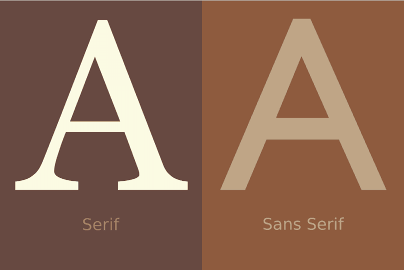
Sans-serif fonts are easier to read on a screen while serif fonts are easier to read on paper. The details and science behind this are beyond the scope of this training, so I won’t be going into detail about it. However, please keep this in mind as you begin creating your content. The example shows a great comparison between sans-serif and serif font.

Serif (left) versus sans-serif font (right). Notice the slight extra elements, called serifs, on the legs of the letter “A” to the left.
Image Created by John Lemasney | CC BY 2.0
Never Justify Your Text
Another difference between web content and print media is that text alignment in print is almost always justified. This is because text in print, especially in magazines and newspapers, is usually formatted in columns, and justifying text makes the edges nice and neat. However, web content is almost always formatted in a single-column, so it’s not important for the edges to align well. When web content is justified, gaps between the words become bigger and interrupt the reading experience. This effect looks even worse on smaller devices, like smartphones and tablets. Plus, justified text is a nightmare to code. So, it’s best to never justify the text of your articles.

Justified (left) versus left-aligned text (right). Note how the gaps in between words on the justified text is distracting and interrupts the natural flow of the eye.
Strike a Balance Between SEO and User Experience (UX)
To boost your on-page SEO and lay the foundations to get ranked for your chosen keyword, insert those keywords into the text of your article. However, don’t overdo it to the point that your articles are unreadable and UX suffers. Sacrifice UX and your prospects of success go down the drain.
Insert Images Throughout the Article
Paragraphs should be broken up so readers aren’t facing walls of text and adding images can help with that. Images add visual appeal to your content. Just make sure the images you select are relevant to the subject of your blog post and not just there to look pretty.