When using WordPress, the chosen theme heavily dictates your website design. I want to outline some crucial design tips, especially for beginners in this industry, to create a profitable website as quickly as possible.
Pick Your Battles
Before thinking about a theme, website design, and all the aesthetics, I want to make an important point about what your mindset should be.
As you set out to create a profitable Internet Marketing business, you will find that you’re about to encounter dozens of battles over the next several months. It’s very important that you pick your battles wisely.

Sadly, a battle many people pick very early on, including myself, is website appearance and design. Design doesn’t matter until traffic is consistent, and to start getting traffic, all you need design-wise is a simple website that’s easy to navigate and mobile responsive.
For now, the focus should be on traffic-producing activities, such as high-quality content. Every second spent thinking about unnecessary design elements is a second taken away from producing high-quality content, and that’s time taken away from generating traffic, which means delaying your success.
Design Elements That Matter Right Now
If you’re just starting out, the only things that matter, in terms of website design, are that your website is clean, easy to navigate, and mobile responsive – THAT’S IT.
As you create content and optimize it for search engines, there will be other elements to bear in mind. However, the ones mentioned above are all that matter right now. When selecting a theme, make sure it has all three.
Examples of elements that aren’t important at this stage and can be added or changed later are image headers and website colors (or color combinations). Too many people become stuck when they get started struggling to figure out the background or font color. Spending time on aesthetics at this point is a waste of time. There are more important and pressing aspects to spend your time on.
Selecting The Best WordPress Theme For Your Niche Site
Theme selection can be fun and exciting; however, it can turn into an overwhelming experience without the right guidance. When selecting a WordPress theme for your niche site, keep the following tips in mind to ensure you select a suitable theme:
Avoid a Header Image
On many business websites there’s a huge image that serves to establish the brand and welcome visitors. This image is very important because it’s the first thing visitors see. When people select themes with header images, they tend to spend a lot of time searching for a high-resolution image to use and worrying whether it’s the right image, and that can be problematic. The time spent looking for a suitable image to use would be better spent on creating content.
Avoid Unnecessary Banner or Homepage Widgets
Many company websites have sections of text that detail what they do and what they’re about; although these elements, or widgets, look really cool, they’re difficult to set up. These widgets vary a lot across different themes and don’t add anything to your content at this point. It’s wise to avoid themes with these widgets and focus on things that matter.
Find a Homepage That Can Display Recent Posts Well
The Recent Posts widget is the only widget that should be included on your homepage. This widget displays all your recent posts and automatically updates whenever you publish a new one. Although WordPress offers this widget by default, some themes don’t display it prominently on the homepage. Recent posts should be easy to find on your homepage.
Aim for a Simple Set Up
It’s tempting to choose a stunning theme with all the bells and whistles. Themes like that typically come with complicated set ups that you want to avoid. The sooner you get set up, the sooner you can start creating high-quality content that will generate traffic.
How to Install and Activate a WordPress Theme
Now that you know what to look for in a WordPress theme, let’s go through installing one on your WordPress site.
First, click on the “Appearance” menu option on the left-hand side of your WordPress Dashboard, then click “Themes.” This action will navigate to the “Themes” page where you can install and activate themes.
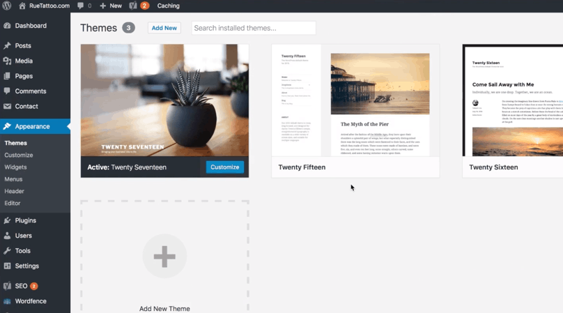
WordPress Dashboard, Appearance, “Themes” page. Note that when hovering over a theme, additional options such as Theme Details, Activate, and Live Preview are displayed.
To add a theme to your WordPress site, click “Add New” to access the “Add Themes” page. This is where all the available themes can be previewed, selected, and installed on your site.
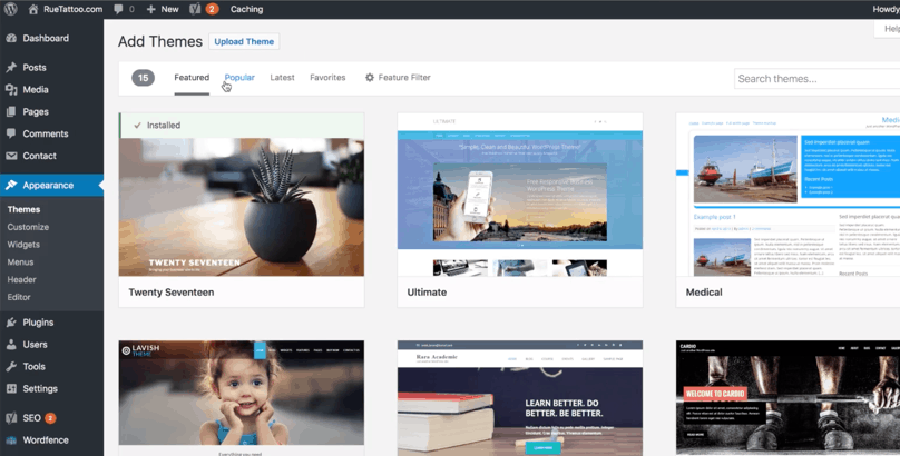
WordPress Dashboard, Appearance, Themes, “Add Themes” page
Going through all the available themes will take hours, if not days. Take my advice and select a theme that has no image header and is clean, easy to navigate, and mobile-responsive. Also keep in mind that like plugins, it’s better to choose one that’s regularly updated for security purposes.
How to Check If A Theme Is Mobile Responsive
A mobile-responsive website adjusts accordingly to the screen from which it’s viewed, which in most cases these days is a mobile device. A site should be mobile-responsive because mobile use is on the rise and you want to reach as many people as possible. When visitors encounter your site on a mobile phone and find that it’s not mobile-responsive, they will more than likely click away.

Being mobile responsive also benefits your site in terms of SEO. Google has recently announced that mobile-friendly sites will essentially be favored when it comes to ranking.
So, how do you check if the theme you like is mobile responsive?
The easiest way to check is by resizing the browser you’re using to examine the theme (make sure it’s not maximized before doing this). Simply drag the corner of the browser window until it’s resized to tablet or mobile phone proportions. If the layout changes based on the window size, that is, the page elements rearrange so that you don’t need to scroll horizontally, that means it’s responsive.
Another way to check mobile responsiveness is on a mobile phone. If your chosen theme has a dedicated demo site, type the URL into a browser on your mobile phone. If the elements are rearranged, the theme is responsive.
If you’re still not sure, use Google’s Mobile-Friendly Test page. It’s fairly easy to use: enter the URL of the demo site then click “Run Test.” Google will notify if the theme is mobile-responsive or not.
Recommended Readings
How To Design Your Own Blog: Simple Tips From A Non-Designer
A great blog design is crucial to its success. But you may not need to hire a designer. This article will guide you on how to design your own blog.
Blog Design: 7 Principles Of User Interface Design You Need To Know
Blog design is a crucial but often overlooked aspect. In this article, we walk through the 7 principles of user interface design that you can apply to your blog.