(5) comments
Add Your Reply

You’ve had your blog for a while. Engaging, shareable, high-quality content. Solid promotion strategy. Is traffic to your blog still lower than your target? Are you still struggling to get leads from your blog? It could be your blog design. In today’s article, I’m going to present some guidelines on how to design your own blog.
If content is king, why pay attention to anything else?
Remember the two main goals you have with every blog post you create. You want
So, what will make them do that? High-quality content, of course. But a great blog design makes good content even better.
How?
Your blog design should make your content easier to read and help quickly show your reader the points you want to highlight. A good blog design directs your reader’s attention to what they should read first and what’s important in your post. Casual visitors should be able to understand and navigate your blog within the first minutes of seeing your blog, such that when they become regular readers, they are able ignore the design because navigation is so intuitive for them.
In addition, your blog design should invoke trust. A clean, professional design that’s free of clutter and unnecessary elements and features is key to being trustworthy. I mean, would you trust a blog that changes your mouse pointer, blasts music, and has a Comic Sans font? Having a premium, or even custom, theme installed on your blog shows your reader that you are a serious blogger and that you are committed to your blog.
With all these in mind, here are some guidelines to help you design your own blog.
Note: I highly recommend using WordPress for your blog (here’s why). But if you’re not using WordPress, you can skip this section and jump to the next.
When you’re just starting out, selecting your WordPress theme can be overwhelming, especially when you consider that your theme will dictate your blog’s overall look. You’ll want a theme that looks good on its own but still customizable to a degree.
With thousands of options available, how do you choose the right one? Here are some guidelines.
The short answer is premium, if you can afford it.
Free WordPress themes are workable, but two major issues are the code, which may be outdated, and the lack of support. Premium WordPress themes (i.e., paid) come with regularly updated code, good documentation, and access to support (sometimes 24/7!). Popular providers of premium themes include StudioPress, Elegant Themes, and ThemeForest.
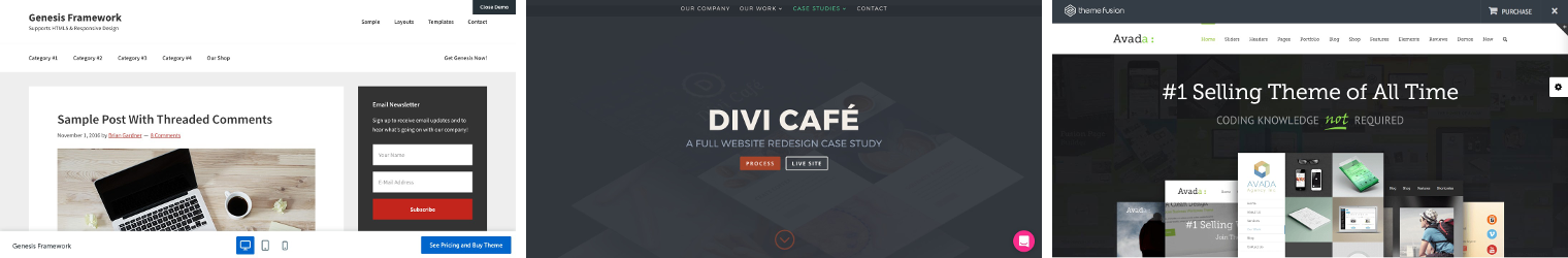
The bestselling themes of StudioPress, Elegant Themes, and Themeforest. (From L-R): Genesis Framework, Divi Theme, Avada Theme (Click to Zoom)
If you don’t want to spend hundreds of dollars on your theme when you’re just starting out, you can start with a free theme first and then just change to a paid one later on. It’s pretty straightforward to do, but you might have to work on changing some settings. The good news is, with a paid theme, you can get the developers to help you with changing your theme if you run into technical difficulties.
According to a study by StatCounter, the most popular browser worldwide as of July 2017 is Chrome, followed by Safari. It makes sense to see how your blog looks on these browsers, but don’t forget the other browsers, such as Firefox, Opera, and Internet Explorer (unless your target reading audience is in China, it doesn’t make much sense to test how your site looks in UC Browser).
Being responsive, i.e., compatible with mobile browsing, isn’t optional anymore. You’ll need a theme that looks good on a desktop, smartphone, or a tablet. Why? Mobile devices account for more than half of web traffic nowadays. Readers get turned off by sites that look wonky on their handheld devices and will happily browse somewhere else.
A quick way to test if a theme is responsive is by resizing your browser screen and checking if the elements are still displayed completely. Another way is to use Google’s Mobile-Friendly Test page. Still another way is to use Google Chrome’s Developer Tools.
Beginners especially have to take this into consideration. If you’re a developer, no biggie, but if you know very little about code, you’ll want to choose a theme that’s easy to tinker with. Check if the customization settings are organized and if the usual settings you would tweak are easy to find.
Ideally, all you need to adjust will be in one place but if they’re not, assess if you’re comfortable with navigating. Time is precious, and you don’t want to lose it looking for important settings so you can tweak them.
You might think to yourself, Why would a hacker even try to get into my blog? I’m just starting, and it’s so small!
First of all, much WordPress hacking is automated. Hackers use other hacked websites to automate the process of hacking other WordPress sites. So it doesn’t matter how small the number of your visitors is. Your blog can be the victim of a hacking.
Again, why? First, hacked websites can be used to introduce viruses to its visitors whose security in their own computer isn’t up to date. At the very least, they can inject new ads into every site these visitors browse, making money for the sellers of those advertising spaces. They may log keyboard presses and mouse clicks so they can get these visitors’ passwords. At worst, they can introduce ransomware into their sites, wherein the data on these laptops are encrypted so that the user can’t access them unless they pay some kind of ransom.
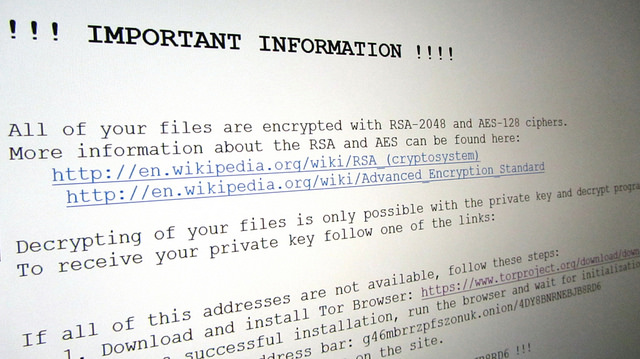
Photo credit: Christiaan Colen via Foter.com | CC BY-SA
Another reason hackers would want to hack your blog is they want to harness the computing power of the server your blog is on. This can be used to mine digital currencies, such as Bitcoin, or send spam emails disguised as coming from your server. Bottom line is, don’t be complacent about security.
This is yet another area where premium themes have an edge against free themes, as developers of premium themes are much more likely to keep their theme updated with security features. Alternatively, you can also look at reviews and ratings of the theme. Aside from having a good feel for how many users are actually using the theme, you’ll find out if the theme you’re considering has had security attacks before and if they were fixed by the developer or not.
Page loading times have a huge impact on user experience. Visitors tend to be impatient, especially if they’re on their mobile phones. If you select a clean simple theme, then this should be less of a concern for you, compared to themes that are heavy on features (e.g., animation, video, fancy sliders, etc.).
There are tools such as GTmetrix, Pingdom Website Speed Test, and Google’s PageSpeed Insights that can help you determine how fast or how slow your website loads and which aspects are affecting performance.
Note: You may have read somewhere that “40% of visitors will abandon a site that takes more than 3 seconds to load.” While that is a good rule of thumb when measuring how fast your blog loads, here’s why you should take that study with a grain of salt.
Some WordPress free themes do offer great support, but many free themes also don’t offer any. Again, you’ll see that premium themes have an edge in this, as most of them offer complete documentation for setup, good knowledge bases (usually searchable), and email- or even phone-based support so you have an actual person to ask if you do have problems with your theme.
At the minimum, your theme should be able to support plugins for SEO (my pick: Yoast SEO), site speed and performance (my pick: W3 Total Cache), comment spam prevention (my pick: Akismet), contact form (my pick: Contact Form 7), and social media (my pick: Shareaholic).
These are just the essentials, not to mention the plugins you’ll need when you decide to add functionality to your blog. You need to make sure that the theme you select is compatible to the plugins you’ll need to use.
While I always say “Think of your reader,” you also need to ensure that your theme is a good fit for your personality. I can’t stress enough the importance of being authentic, so it’s best to select a theme that you think is reflective of who you are. This is more a case of “you’ll know it when you see it,” but as a general rule, if you feel comfortable with it and you like it, then it’s probably a good fit for you.
Of course, other than personality, you’ll need to consider the type of content that you’re going to be publishing. Many themes have been designed with a particular content in mind (e.g., for writers, photographers, graphic designers, travel writers, etc.), so that’s a good place to start with. This has more to do with the blog niche you’re in, so think about it carefully.
Most good themes, free or paid, have a demo version that you can play around with. Take the extra time to test! Look for those aspects that I’ve listed above and see if that theme is something you’ll be comfortable using every day.

Aside from the items above, check how the homepage and the blog posts look. Is there an option to create landing pages? Can you easily customize elements? Can you envision your content being presented that way? Can you intuitively find your way around the site (because if you can’t, then chances are your reader won’t, either)
It certainly looks like there are a lot of things to consider when choosing a theme, and there are! So don’t be rushing to download the first theme that tickles your fancy. Give it some careful thought.
Whatever theme you choose, it’s not going to be perfect and you’ll almost always have to make some compromises. That’s okay. If you followed my guidelines, you should have eliminated the really bad themes and narrowed your choices down to the better-quality ones.
Now that you’ve chosen your theme, you have more or less a framework that you can now customize. Now, we take a look at individual page elements and learn how you can optimize these elements to improve the usability of your site and increase your traffic.
Your homepage needs to answer the question, “Why should I stay on this website?” It needs to intrigue visitors enough to scroll down to your important content. It should also provide information about you and what your blog is all about. If you just display a list of links to your most recent posts, you’re missing out on a golden opportunity to put your best foot forward.
Keep in mind that the homepage is probably the second page your visitors will see after they find one of your blog posts from search or from a share on social media. Even so, this is still a great chance to present yourself and what your blog is about to curious visitors.
First, address your visitors and greet them. Introduce yourself and state what you do. Most importantly, share the purpose of your blog such that you make your visitors curious and make them want to read on.
You can approach this in a number of ways. For example, if you blog about reviews of gadgets, a one-liner like “Welcome to Tech by Jordan, where I give honest reviews of the hottest gadgets” is short and informative.
Numerous other elements can go into your homepage as well, such as an email list sign up form, featured posts, social feeds (usually Instagram, Twitter), About Me widget, and of course, your recent posts. However, restrain yourself from integrating all the widgets in your homepage. Pick and choose the ones that you want to emphasize.
The header is the top part of the web page. Because of its position and the fact that you see it in all your pages and posts (except sales pages and landing pages), it’s a prime piece of web page real estate.
You’ll want to place a logo if you have one. This keeps your brand prominent on all your pages. Aside from that, you’ll want to place links to the homepage (though oftentimes, the logo does this function) and to the most important pages or posts on your blog. To start with, you could put “Home,” “Categories,” and “About Me.” If you already have 30 or more blog posts, you may also want to put a search field on there. Most blogs also have a short call to action (CTA) if they have a digital product or freebie they want to promote.
For example, this is our header (Click to Zoom). Clicking the logo will direct you to our homepage.
If you want to add any more than the basics, really think hard whether it will benefit your readers. If you’re still in doubt, test it. If your addition barely gets any clicks, maybe it’s time to remove it.
In addition, check how it displays on smartphones. Nothing more bothersome than a header covering half the content on your smartphone. This is yet another reason why you need to select a responsive theme because mobile-responsive themes normally compress these to save on space.
Whitespace is technically the absence of an element as opposed to an actual element, but creating whitespace is an essential of your design. It draws attention to the content and elements you want your reader to focus on.
You may already have this on your navigation bar, but if not, consider placing a search box just below your header, on your sidebar, or on your footer. This is especially important if you have a content-heavy blog with a large archive.
The footer is where readers usually look for your Contact page and Privacy Policy. This is also the default hangout of the Copyright Notice, Terms of Use, Social Icons, and Sitemap (though no one really clicks this; it’s for the search bots). That seems like a lot of boring legalese, and it’ll take more than a single blog post to discuss the differences, but you can research on these separately.
Sidebars are narrow columns that can appear to the left, right, or even both sides of your main content. They’re a great location to place important information that you want your readers to have easy access to. It’s up to you to decide which elements you think are most useful to your readers, but the usual elements here are an email subscribe box, a category list (if you don’t already have it on your header), most popular posts, search box, and CTAs.
At the risk of sounding repetitive, always have your readers’ convenience at heart when designing these page elements. An excellent reader experience should be the driving force behind all your design decisions.
Once you have your theme and basic page elements in place, you can start fiddling around with the aesthetics of your site that are more subtle, but nonetheless impact your readers’ experience with your site.
It’s not a particularly fun or sexy aspect of design, but typography can make a huge difference to the effectiveness of your blog design. Your typeface must be legible, enjoyable to read, and closely fit the tone of the content of your blog. The goal is to engage your reader, and so it should be unique yet nondistracting to the actual content that they’re reading.
Confused yet? Here are some general guidelines to selecting the right fonts for your blog:
Unless you know what you’re doing, a good rule of thumb is to select one font for your titles and headings, and a second font for your body copy.
Ah, the perpetual question for designers. Serif fonts (e.g., Times New Roman, Georgia) have serifs, which are the little extenders hanging off the edge of each stroke, while sans serif fonts (e.g., Arial, Helvetica), as implied by their name, don’t have those extenders. Traditionally, serif fonts are used for print to improve readability. Thus, using them in webpages evoke a traditional feel, while sans serif fonts evoke a more modern feel.
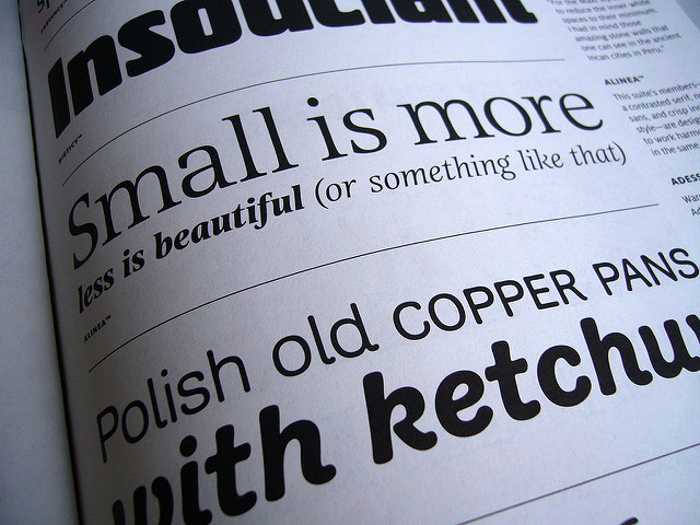
Photo credit: Stewf via Foter.com | CC BY-NC-SA
As a general rule, fonts smaller than 16 pixels are difficult to understand, especially when your blog is viewed on mobile devices. Some designers even opt to select fonts that are at least 20 px. Don’t go overboard with this, though. Test your pages on mobile devices as well as desktop devices so you can optimize the font size.
You’ll also want your headings to follow a visual hierarchy, so considering you have to define at least 6 heading types (h1 to h6, with h1 as your title), select a font for your heading that looks nice in every size.
Well-designed fonts for the web have even letter spacing. Letters should not be too close to or too far from each other, otherwise, it’s going to be distracting for your readers.
The spaces between lines of text are also important. As a general rule, blocks of text are easier to read when the spaces between the lines are larger than the spaces between words.
There should be a good amount of contrast between your background and your text. The classic combination of black text against a white background is a good starting point. If you want to change it up, try using other light backgrounds, but always keep the contrast in consideration.
Those are just general guidelines, but If you want to know more about typography, Professional Web Typography and The Elements of Typographic Style Applied to the Web are great comprehensive references.
Colors convey messages, evoke emotions, and highlight important things. Choosing the right colors for your blog is more than just picking out your favorite colors, applying them to your blog, and calling it a day. The colors you use should reflect your branding and your personality, but it should also make your readers feel welcome.
Selecting your color palette needs to be strategic to create just the right response for the readers. Even seasoned web designers go back to basic color theory, using the color wheel and color psychology to select the right color scheme for a blog.
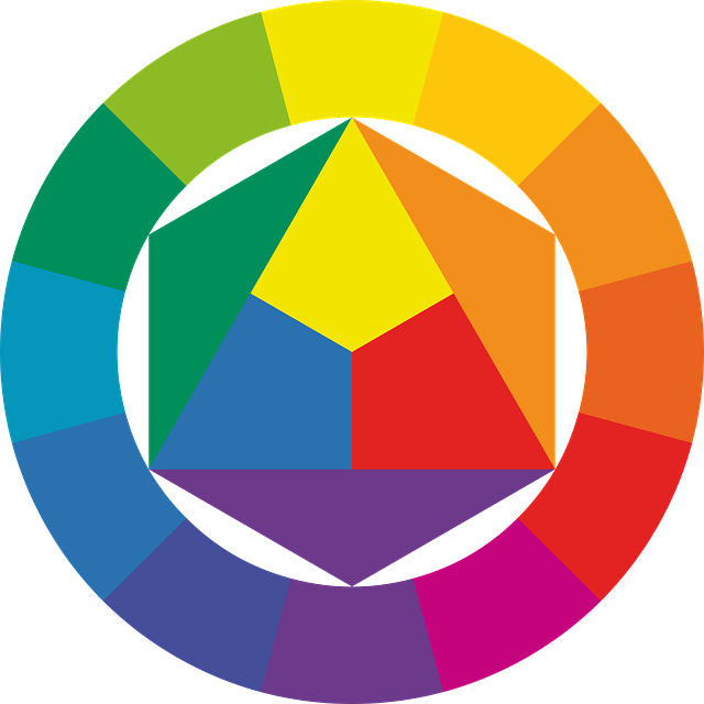
Color psychology studies the effects of color on human behavior. Below is a general overview of colors and the feelings they elicit.
Color schemes can be a bit complicated to discuss. In general, it’s best to use a 3-color palette: 2 colors that go well together, then a third color for accent. Let the above overview guide you so you can choose the colors that reflect the feel of your blog and content and are appropriate for your audience.
For example, if you’re blogging about healthy eating, you might want to use green. If you’re blogging about financial advice, you might want to use blue.
When choosing your first 2 colors, it’s best to pick colors that are beside each other on the color wheel. For example, you might want to use blue and purple. The easy way to select your accent color is to select the color opposite the two colors you selected. In our example, you can choose either orange or yellow as an accent color. If it seems too loud or jarring for you, experiment with different hues or select a color near it to soften the effect.
Now that you have your 3 main colors, start using these colors throughout your blog. You might need to use lighter or darker versions, depending on how the colors look, but don’t be afraid to play around with them. Some online tools you can use to select and play with color schemes are Adobe Color CC, Sphere: Color Theory Visualizer, and Paletton.
Visual communication is the purpose of design, and icons are visual elements that can be both beautiful and functional. Icons are vital in many places offline. For instance, multicultural environments such as airports would need icons because written language isn’t enough.
![]()
In web design, they attach visual cues to elements of a webpage and direct readers to the important parts of the content. They can be used to highlight important pages on your website, represent an action, or to highlight features of your product. For instance, in ecommerce sites, the link to view your cart almost always has an icon of a cart.
They can also be used to conserve space. For example, when you see a magnifying glass icon, you know that means it’s a search function even without a text label. This makes the page a little less cluttered.
However, as with all things, there’s such a thing as using too many icons. It has the same as highlighting everything: the result is that nothing is highlighted. Moreover, using ambiguous icons confuses readers and defeats the purpose.
Bottom line: Use icons if you must, but don’t overdo it and don’t use ambiguous icons.
Similar to icons, eye-catching images or graphics are important to draw attention, but their purpose is actually different. Nowadays it’s almost a requirement to include a so-called “hero” image to immediately brand the blog and communicate to the readers what to expect in a stunning way that a thousand words can’t accomplish.
For example, a blog about photography can have this as a hero image.
A featured image is also almost standard to include in every blog post, which should be able to convey to the reader what the post is all about. Images within blog posts have a different purpose altogether, depending on the content itself: to break up the monotony of text blocks or to provide details and additional information. I’ve discussed it briefly here.
Here are some considerations when using images on your blog:
Always use a high-quality image. You’d think this is an intuitive thing to look for in an image, but you won’t believe how many bloggers insist on using an image that they think is “cool” or fits their post, only to have it display as a pixelated mess. In that case, you’d be better off just not using that image.
The images you use should be connected to the surrounding content in an obvious way. If the connection isn’t clear, it’s going to seem unprofessional and that you placed an image there just because you can. Not good.
You should have at least one image that relates to the post’s content and is something people would want to post on Twitter or Pinterest. Depending on how long the post is, you may have more than one.
Don’t go extreme with this; that is, don’t have zero images, but don’t overdo it either.
Using just one image? Make it count. Place it above the fold so your readers see it immediately.
If the image is small but centered, it creates a lot of whitespace. This is normally great, but too much of it can feel like a waste of screen space. Consider wrapping the text around the image if the text is long enough. However, if you write short, punchy paragraphs, you rarely need to do this.
The sizes of the images in your post affect the loading time. As much as you possibly can, resize images, lower their resolution, or even change the file type to make them smaller and thus load faster. WordPress has a plugin called WP Smush that can compress image files for you.
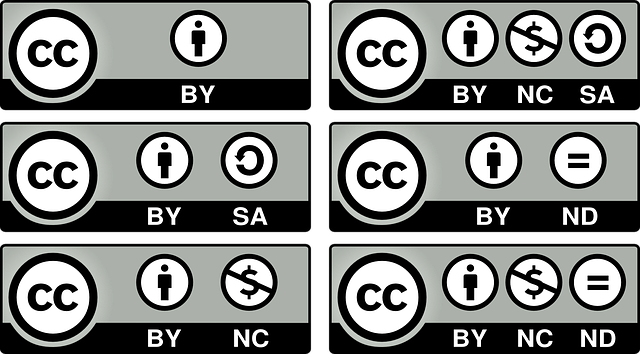
Often overlooked but extremely important, usage rights to images and photos found online are legally binding. For a simple explanation, read this. Violating these can cost you money and your reputation. Just read this cautionary tale.
Your best bet would be to actually buy these photos from a stock site, but if this seems an extravagance, especially when you’re starting out, make sure to get your free stock photos from a reputable provider (we like Pixabay) that provides images under a CC0 license. You can read all about Creative Commons licences here, but if you don’t have the time or can’t be bothered, just look for images with CC0 licences so you can use them on your blog posts freely.
Familiarize yourself with these.
If you absolutely want to use Google Image Search, at least go to Settings > Advanced search and filter by usage rights.
Or you can always use photos you took yourself, slap on a copyright on them, and use them without worrying about impinging on someone’s rights. If your pictures get used illegally, however, you can probably sue. But that’s another story.
The look and feel of your blog are very important, especially since they’re part of the first impression you present to your reader. But it’s never more important than your content or your readers. Also, using beautiful, cool images is never worth breaking the law for.
First, what is a call to action (CTA)?
I’ve discussed a bit about it here, but basically, a CTA tells your visitor exactly what you want them to do next.
CTAs are one of the most crucial tools in inbound marketing because they’re what directs your reader to take a direct action. It’s highly likely that you’ll want to direct them to a landing page, with your product, membership registration, or sign-up form for a coaching class.
In my previous article, I talked about the text that should go into an effective CTA, but here we discuss how your CTA should look.
Position your CTAs where your readers can see them. This would depend largely on how your content is organized, but the most effective ones are normally placed above the fold, inline with the content, or the end of the article. You can also place them on the sidebar so it’s easily accessible to your reader and action can be taken whenever they want.
The CTA should be larger than other elements on the page. If you absolutely must have two CTAs, the more important one should be more dominant.
Size matters, but whitespace does, too. Putting negative space around your CTAs draws attention to it and gives it importance relative to the surrounding content.
CTAs are important enough for you to focus on their aesthetics. Remember the contrast color you picked in the previous section? It’s going to come in handy here. If you selected a great contrast color, it’ll stand out from the other content on your page. Just be careful that you didn’t already use this contrast color in a nearby element, or else the effect is diluted.
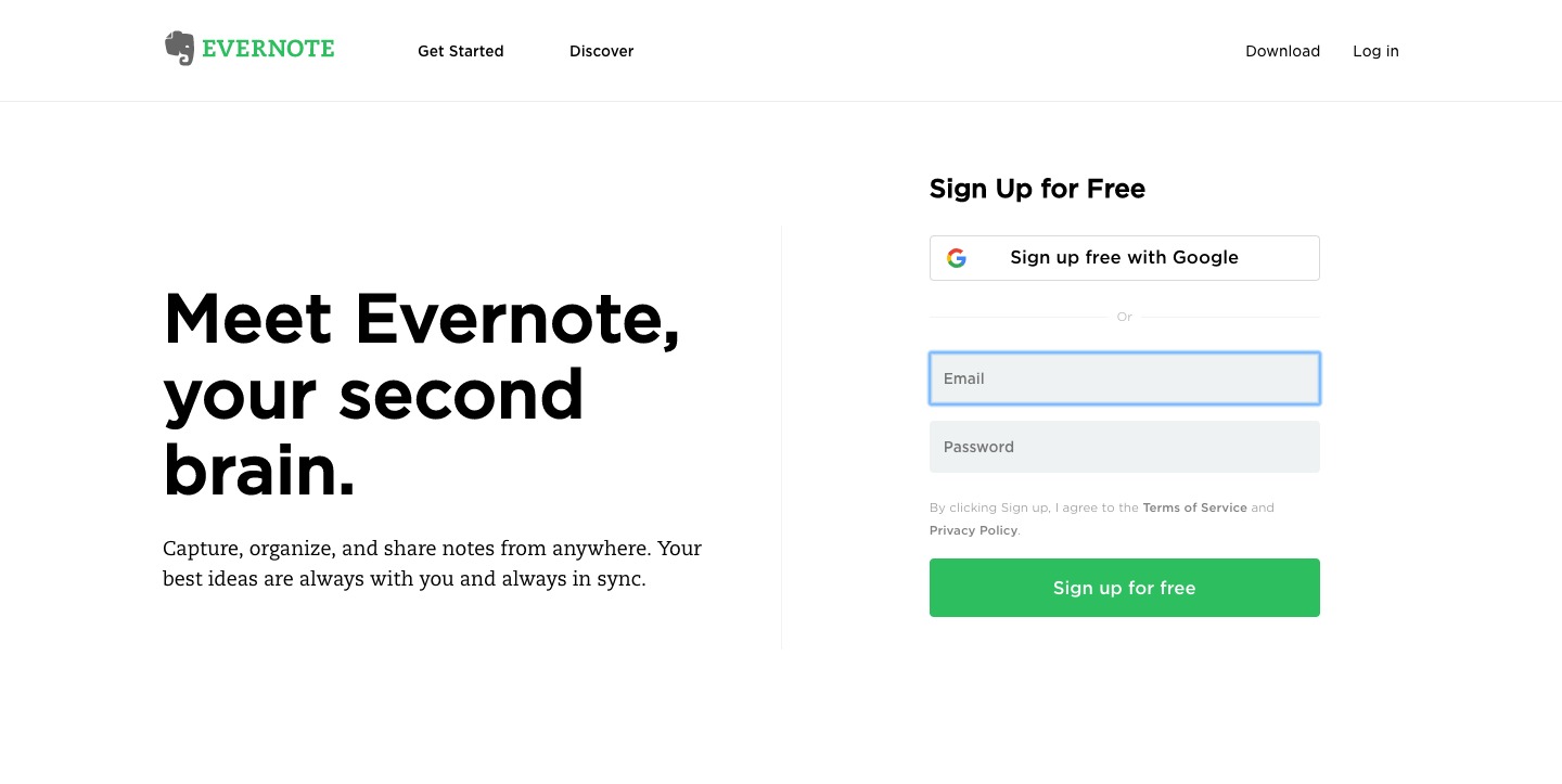
The Evernote CTA is an example of a great CTA. (Click to Zoom)
The shape of the button also matters to a degree. Make your CTA button look “clickable” by adding visual effects like shadows and gradient coloring. Flat designs may be a thing now, but this doesn’t apply to CTA buttons.
Make the font pop out against the button. Experiment with different font sizes, colors, and styles to see which combinations are effective.
Having a CTA on your homepage is a must, but not putting a CTA on every page equals lost opportunities. Again, remember that your CTA needs to direct readers to what you want them to do. When readers reach the end of a page and there’s a dead end, they’ll leave without clicking on anything.
It’s important for CTAs to look professional, but even the sleekest designs fail. There is no single color or design that works. The most effective CTAs get your readers’ attention with the design and then get them to click with compelling text.
Social media is an integral part of your blogging strategy. You want your readers to share your content on their social networks so that you can get more visitors to your site. Aside from creating great content, make it easy for them to share it. The best way to do that is to incorporate social media buttons in your blog design. Here are some considerations when using social sharing buttons.
Consider where your social buttons are located. If they’re way, wayyyyyyy down the page, you could do better. Place social buttons after the title as well, or you can place them on either the left or right of the content. It’s wise to use a social media plugin that is “floating” or “sticky” (like the ones we have on this site) so that as your readers scroll through your content, they’ll have the buttons in their peripheral vision and they’ll always have the chance to share your post at any point.

Aside from placement, how prominent your social media buttons are is important. Increase the visibility of your buttons by using ones that are colored vibrantly or using the contrast color you planned previously. Also, be careful to distance it from navigation buttons so your readers don’t get confused.
With the help of the Click To Tweet plugin, you can easily create tweetable content for your readers and make it simple for them to share on Twitter.
Don’t use just Twitter or Facebook, but don’t use them all. Too many social buttons would just confuse your reader because of too many choices that chances are they’ll just quit without actually sharing. Another great reason to not use all the social buttons is it tends to slow down your site, especially if you’ve placed social buttons on multiple places on your page.
So how many is just right? It depends on your content, but a good number to start is 3: Facebook, Twitter, and Google+. Consider your reader and your blog before adding any more.
The Image Sharer Plugin by SumoMe makes it simple to share images on your site directly on social media that links back to your post. It’s the best plugin for this function so far, but it’s a paid plugin. AddThis has an image sharer function as well, and it’s free!
Speaking of free plugins, here’s a list of popular free plugins that are proven mobile-responsive.
Blog design has a significant impact on social shares. These design tips can help you get more engagement, but if your content isn’t great, it’s not going to get shared no matter how optimal your social sharing buttons look.
Ultimately, the purpose of an excellently designed blog is to complement your quality content to increase reader engagement. I hope these tips on how to design your own blog have been helpful to you. Here are some parting thoughts before you let the creative juices flow all over your blog.

This is applicable to most aspects of your blog, but blog design especially can benefit from simplicity.
Not all of your new visitors go through your homepage. A lot of times, your blog post gets shared on social media and someone clicks the link. Other times, your visitors searched for information and your blog post has it. Every page is an opportunity to make a great first impression.
Improve your homepage, but don’t neglect your other pages.
There are rules of great web design guided by basic design principles, but no matter how you apply these principles, no site will appeal to everyone. Some will love it, some will hate it. However, you do want to make sure that your blog design appeals to those who matter; that is, your target audience.
If you’re blogging to make money, your design needs to guide your readers to subscribe, buy either your product or the products you’re endorsing, or hire you. Never lose sight of this goal when you’re designing your blog.
From the moment you implement your design, do some testing on what works for your readers and what doesn’t. Same thing for implementing anything new, like a new theme, a new set of social sharing buttons, a new color scheme, or a new call to action button.
Sometimes you’ll just feel like changing something, or sometimes you’ll want to test something new. Whatever it is, test its impact on your traffic. Also, test any new design elements in different devices to make sure they’re displayed properly.
How important do you think blog design is to your blog? Which tips do you think will be the most valuable for your blog? Let me know in the comments!
JoAnne is your average, everyday, sane stay-at-home mom who believes in the power of the internet to make dreams come true. She has an insatiable appetite for chocolate, as well as all things internet marketing. She keeps up with the latest trends in blogging, affiliate marketing, e-commerce, and more.
