Menu

If you’re one of the many bloggers that mindlessly typed out their “About Me” page, I don’t blame you! Lots of bloggers take this major part of their blog for granted not realizing the huge potential this page has.
The “About Me” page is one of the most visited pages on a website. It allows you the opportunity to let readers learn more about you or your brand, so it should be treated with as much importance as each blog post you publish.
People who visit your “About Me” page are genuinely interested in you, and are A LOT more likely to subscribe to your email list if they feel like they understand who you are and what you stand for.
So, what should you consider and keep in mind when writing the “About Me” page?
What exactly do we mean by optimizing a page? You’ve probably heard this phrase a lot in the Search Engine Optimization (SEO) and Conversion Rate Optimization (CRO) circles, but optimization actually focuses more on the User Experience (UX).
Focusing on UX means, first and foremost, understanding why a user would click the “About Me” page in the first place.

Here are some of the main reasons why a user reads the “About Me” page:
The broad framework for optimizing an “About Me” page is similar to optimizing a homepage, blog, and “Contact Us” page. There are two simple questions to ask when optimizing every page of your website/blog:
The specifics of optimizing your “About Me” page will flow from the answers to those two questions.
Remember, the point of optimization is to focus on the user’s experience. How did they get to your page? Where did they come from? We must understand the origins of the user to be able to deliver relevant content.
A single page delivers a limited amount of information, so you need to strategize what that information is going to be. You want users to feel like they’re going to miss out so that they will then take action in return (which will be addressed in the next question).
Remember, less is more.
The more information you saturate main pages with, the less likely a user is to remember any of it. Give them less, and they’re more likely to do what you want them to.
Visuals such as explainer videos, diagrams, and hero shots help compact a lot of information into a single page. To get the most out of your visuals, make sure to correctly optimize your images and videos.
This is the area where most pages fall short. One of the critical components of a web page is its call-to-action (CTA), and many website owners don’t realize that every single page of a website should contain at least one CTA.
The point of a home page isn’t for the user to just look at your content and leave. The point of a product page isn’t for the user to see the product and buy it somewhere else. The point of content marketing isn’t for user intake, but rather, for user marketing.
If you retain only one thing from this article, let it be that every web page needs a CTA.
You should take every opportunity to convert your readers, so include at least one CTA in the “About Me” page. Visitors wouldn’t click on your “About Me” page if they weren’t interested in you. If they’re pleased with what they read, they’re more likely to sign up for or purchase whatever you have to offer.
Emphasising the benefits readers get when they subscribe.
Positioning is important. It’s best practice to place CTAs near the last paragraph of your page. Nobody likes being hit with a “SIGN UP NOW” banner the very second they land on a webpage. Don’t worry– most readers scroll to the bottom anyways, so your CTA will more than likely be seen.
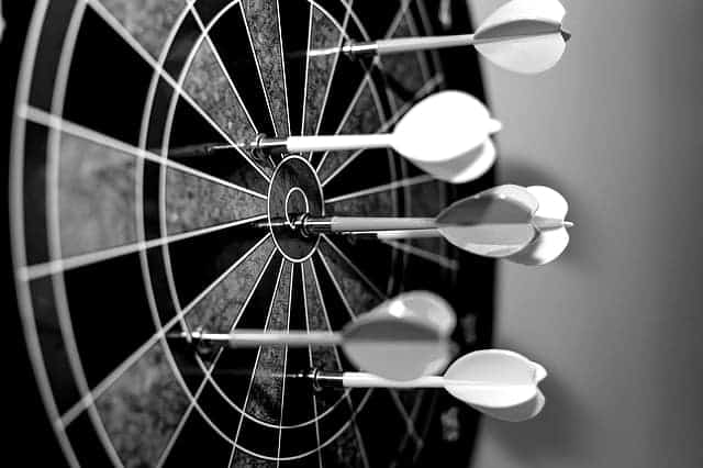
Why am I so insistent about adding a CTA? A web page imparts knowledge, and that knowledge requires a response. So, what is it that you want the user to do? You want the user to convert. This is your goal for the user, and it must be clearly defined as you face the big optimization question.
Anyone can start a website today and claim to be an expert in anything. It’s as easy as buying a domain name and hosting. So what separates you and what makes you an expert in the eyes of your readers is that you don’t just make claims, you have visible proof of your expertise.
This could be in the form of testimonials, social proof, trust logos from established sites, and basically anything that can back up your claim.
Brian Dean of Backlinko.com does a good job of establishing his authority and credibility within his niche on his “About Me” page. The first half contains trust logos from sites he’s worked with while the second half describes how he got his business started.
You’ve got to show users/visitors/people that you know what you’re talking about. Making erroneous claims like “Hey, listen to me because I own a fancy car!” is not enough. You should be able to back up whatever claim you make in an authentic and trustworthy manner. Doing anything otherwise on your “About Me” page only raises eyebrows.
Let your readers see who you are – literally. A photo is an essential element of your “About Me” page. Readers want to see or have an idea of the person behind the words. We, as humans, naturally relate to faces, so a nice picture of yourself helps establish a connection with your audience.
Remember to smile in your photo as this instantly makes you more approachable and establishes trust with your audience right away. Place your photo at the very top of the page so that it’s one of the first things people see.
Don’t post a selfie, though! A professional quality photo is best, but if you’re on a budget, a high-quality cell phone picture will also work.
As much as you promote your products and services, make sure to establish your brand, too. People tend to want to associate with the person more than the business.

Here are additional tips to keep in mind as you develop your “About me” page.
This tip couldn’t be any more simple. Adding your name at the beginning of the “About Me” page instantly creates a deeper connection with your readers. In addition to a photo, you’re no longer a faceless brand.
This can be as simple as “Hi, I’m Ian” or “Who’s Ian?” (with your name instead of mine, of course).
When writing your bio, it’s more beneficial to use a 3rd person perspective.
Why?
Because this makes you appear as more of an authority in your niche, which adds credibility to your brand, and adds a tone of seriousness and formality.
Take my bio, for example. This is how it reads written in the first person.
1st Person Example:
“In a world of bad actors, I’m aiming to be the ‘good guy’ by unveiling scams and teaching with a track record, not one-time success.
I started one of the very first truly unbiased internet marketing review sites in 2011. I’ve been helping people online ever since.
Despite the cease & desist letters, the threatened lawsuits, and the extortion threats immoral product publishers have used against me and my family in an attempt to silence me, I continue doing everything I can to keep people safe in this dog-eat-dog industry.”
And this is how my “About Me” page bio reads written in the third person.
3rd Person Example:
“In a world of bad actors, Ian’s aiming to be the ‘good guy’ by unveiling scams and teaching with a track record, not one-time success.
He started one of the very first truly unbiased internet marketing review sites in 2011. He’s been helping people online ever since.
Despite the cease & desist letters, the threatened lawsuits, and the extortion threats immoral product publishers have used against Ian and his family in an attempt to silence him, he continues doing everything he can to keep people safe in this dog-eat-dog industry.”
You see what I mean? Replace the “I” with “he” or “she” and your bio instantly sounds more authoritative.
Since the “About Me” page is one of the most visited pages on your blog, you should take advantage of the traffic it attracts. If you already have an “About Me” page, evaluate it for areas where you could apply what you’ve learned from this article by crossing off this checklist:
If you’re currently working on your “About Me” page, try to implement as many of the tips outlined in this article to quickly transform your “About Me” page into a subscriber converting machine.
Do you have any other tips to add? Did this article change your perspective on the “About Me “page? Share your thoughts in the comments below.
I've been in internet marketing for over 10 years, and I've purchased dozens of illegitimate products for the sole purpose of evaluating them and exposing the truth about these products to anyone who's thinking about purchasing it. I never let money influence my rating of a product and your success/safety is my absolute highest priority. Don't want to buy a product? Register for one of my 100% free internet marketing training courses>>
