(5) comments
Add Your Reply

Building a landing page is something that all bloggers will need to do at some point. Whether it’s for your lead magnet/s or for your products, the end goal is to convince visitors to click your call to action. In this article, I’ll go through the 7 essential elements of a landing page, tips on creating these elements, and examples of these elements in action.
You might be thinking: “What in the world do I need a landing page for? I’m just starting to get the hang of blogging and getting more people to read it. I’m not selling anything*.”
All bloggers need at least one: a landing page that promotes your mailing list. The sole purpose of this landing page would be to collect email addresses that will allow you to connect with your readers and market to them at the right time in exchange for a lead magnet or some other offer.
Thus, what you want is your landing page to convert; that is, you want your casual readers to convert to a lead and a contact on your mailing list.
How can your landing page convince your readers to be part of your mailing list? You need to optimize your landing page. Here are the 7 essential elements of a landing page you’ll need to get right so you can maximize your conversions.
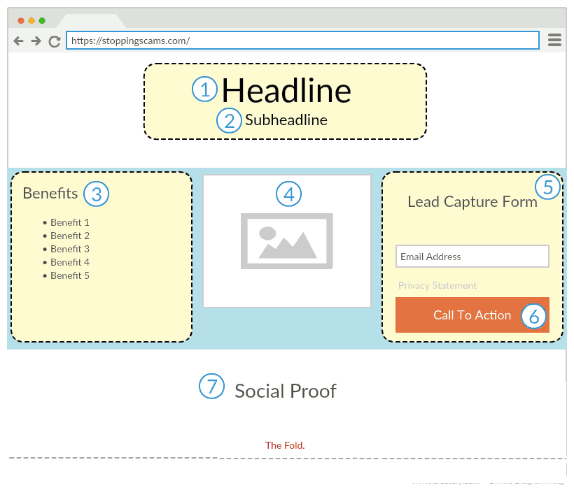
I’ll discuss these elements individually in the following sections, as well as some examples of these elements in action.
Disclaimer: I DON’T have access to information about exactly how well these landing pages are converting, so treat the examples as jumping-off points rather than absolute models or standards.
*P.S. If you’re planning to sell on your blog, my posts on making and selling digital products might be helpful to you. If you plan to go into affiliate marketing instead, here are the basics you’ll need to learn.
The headline is the first thing your visitors see when they land on your page. Make a fantastic first impression with your headline and your visitors will stay and read. Make a not-so-fantastic impression and your visitors will click away.
Thus, the headline is the most powerful part of your landing page. If your headline is weak, all the copy and all the images in the world won’t save your landing page from the dreaded Close button.
Sounds scary, doesn’t it? But it really doesn’t have to be if you keep in mind what the headline is supposed to accomplish. Here are the objectives of the headline to keep in mind while you’re writing them.
A headline has three important purposes: to make a clear promise, to draw attention, and to speak to whom the message is for.
The headline should never suffer from ambiguity and metaphors. Get to the point. Make what you’re offering explicit in your headline. If you’re offering a free ebook, say you’re offering a free ebook. If you’re offering a webinar, say you’re offering a webinar.
Pique your readers’ curiosity and get them to want to know what your offer is all about. Cliffhangers work very well here. Buzzfeed uses this technique to almost a ridiculous degree because it works. It doesn’t hurt to sometimes think “If Buzzfeed were to write this headline, what would it say?”
This may result in headlines like “This Free eBook Will Change The Way You Blog” and it’s almost clickbait-y, but if it works, it works!
Your headline needs to speak to your target audience. Addressing their specific concerns and desires would definitely strike a chord with them.
At the same time, you need to turn off those who aren’t part of your target audience. This is not about being rude to them; this is simply about being explicit enough in your headline so that no one wastes time with your offer when it’s clearly not for them.
In short, your headline needs to make your target audience think, “Hmm, I want to know more,” and your nontarget audience to think, “Eh. I don’t care.”
If you want your readers to notice the headline, you’ll need to format it accordingly. Here are some formatting tips to make your headline as noticeable as possible.
There isn’t a single formula that will work for all. Your results may vary depending on your niche and your target audience. But it doesn’t mean you can’t try some formulas when writing headlines.
This type of headline keeps it straightforward and says what it’s all about without any tricks.
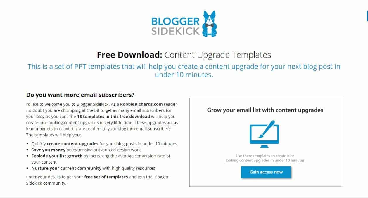
An example of this headline is in Blogger Sidekick’s landing page for their content upgrade.
Click To Zoom
“Free Download: Content Upgrade Templates” is as straightforward as you can get.
This type of headline provides a solution to a specific problem your readers have. It doesn’t even have to have the exact words “how to”; it just has to answer their “how to” question.
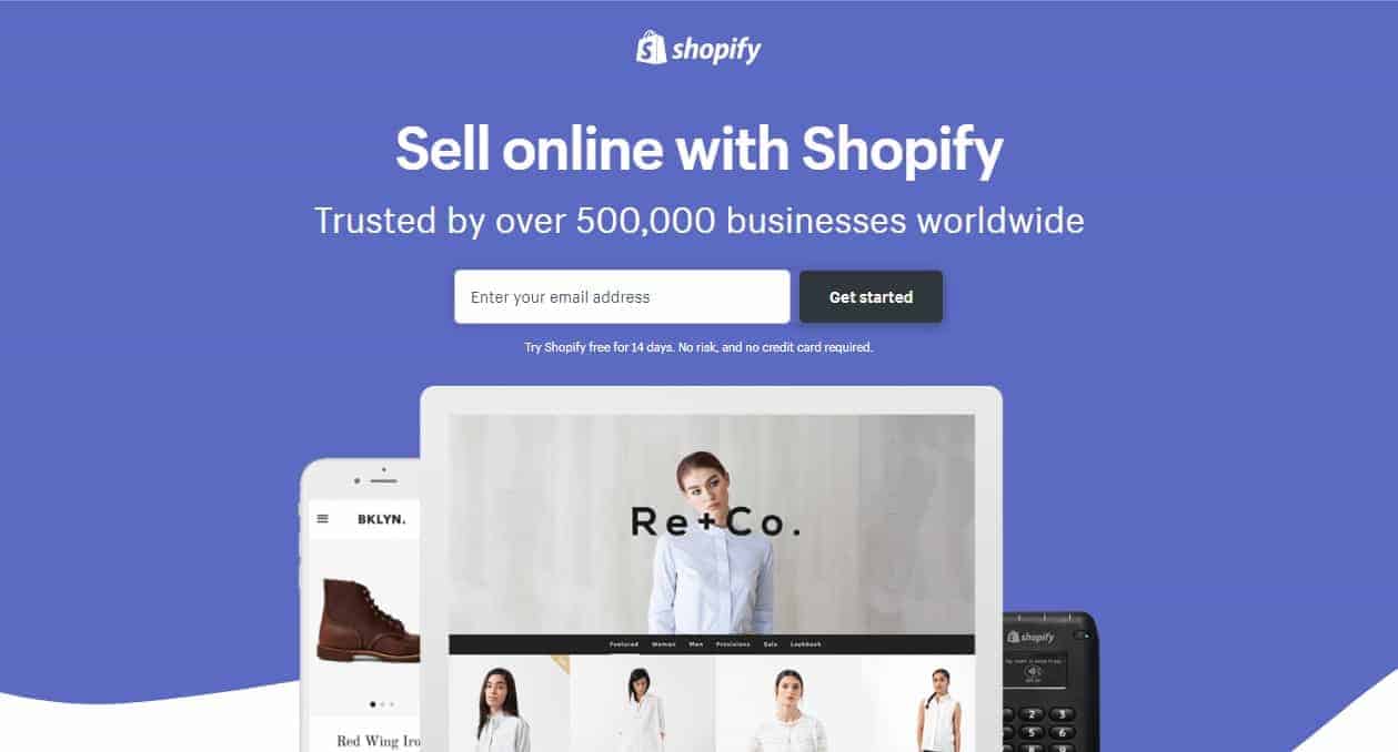
An example of this headline is in Shopify’s landing page for their free trial.
Click To Zoom
The question is “How can I sell products online?” and the answer is “Sell online with Shopify.”
This type of headline is everywhere, not just on landing pages. Why? It simply works.
It can be a count, a percentage, a fraction, or a statistic. Whatever it is, it allows your reader to visualize your offer better.
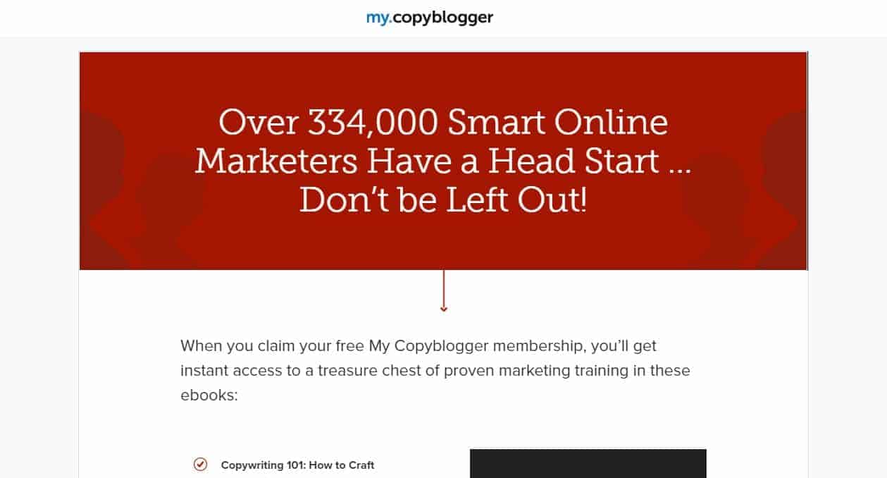
An example of this headline is in Copyblogger’s landing page for their membership site my.copyblogger.
Click To Zoom
Numbers plus FOMO (that’s “fear of missing out” for us nonmillenials) equals a striking headline. Wouldn’t you want to join 334,000 people?
This type of headline directs readers to take a specific action that benefits them. Apparently, being bossy works if you tell the reader to take an action that’s good for them.
An example of this headline is Kissmetrics’ landing page for one of their free ebooks.
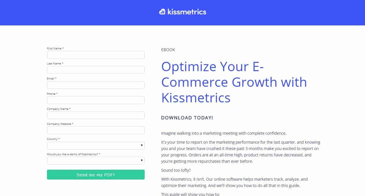
Click To Zoom
“Optimize Your E-Commerce Growth” tells the reader to perform a specific task that is for their own benefit.
Final Note: Notice how the headlines only attract those audiences that they’re targeting? For instance, if you don’t want to sell online, then you’re probably going to skip away from Shopify’s landing page.
Do you even need a subheadline?
The short answer is “Yes.”
You made them look with your headline, now reel them in and make them stay with your subheadline.
A subheadline has three important purposes: to support the headline, to elaborate on the benefits and value of your offer, and to persuade your reader to read on.
Your headline plus subheadline should be a one-two punch of persuasion. They should complement each other.
You don’t have much room in the headline, so your subheadline should do more explaining to your reader about how your offer can help them.
Evoke more curiosity so your reader will want to keep reading. Make sure your subheadline bridges the gap between the headline and the rest of your landing page.
Subheadlines are too dependent on their headlines that it would be unrealistic to list down formulas. Instead, I can give you examples of subheadlines that work.
Blogger Sidekick
Click To Zoom
Yup, this again. But this time, notice how their subheadline reinforces the headline (“This is a set of PPT templates”), expounds on the benefit (“help you create a content upgrade”), and evokes curiosity (“in under 10 minutes”).
HubSpot
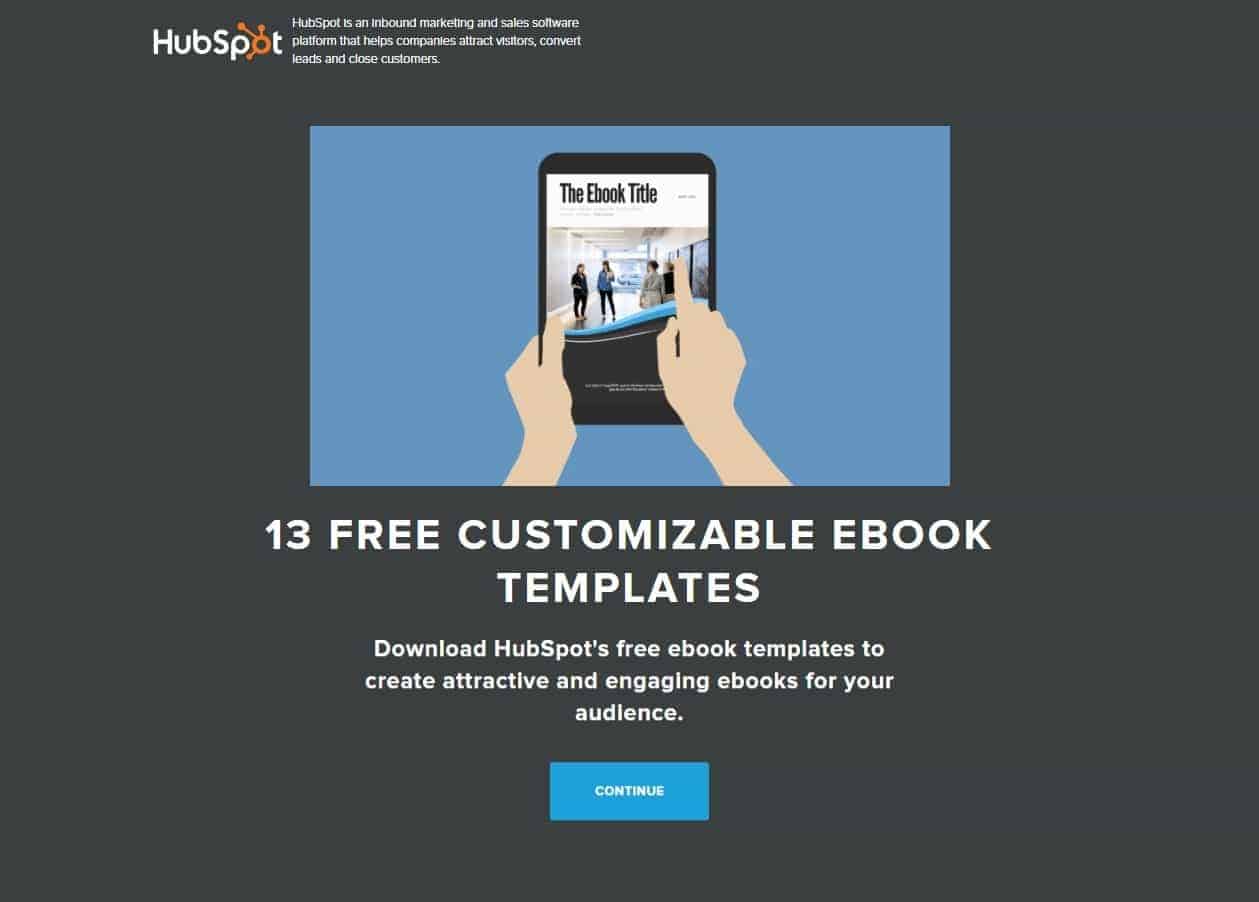
Click To Zoom
Again, a great example of how a subheadline can support the headline (“free ebook templates”) and explain the benefit (“create attractive and engaging ebooks for your audience”).
Simply Measured
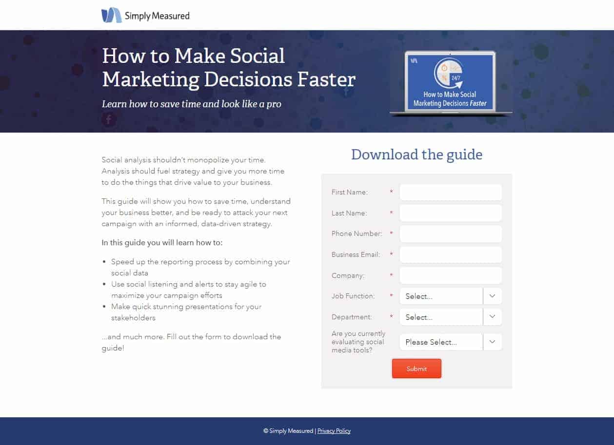
Click To Zoom
This one gives more details on the benefits (“learn how to save time and look like a pro”), since the “how to” headline pretty much describes what you can expect from the free guide they’re offering.
Sometimes, your headline and subheadline are enough to convince your readers to sign up for whatever you’re offering.
Oftentimes, they need a little more convincing. This is where listing the specific benefits of your offer comes in.
It’s easy to just list down the features of your offer. But the truth is, your reader doesn’t give a doesn’t care.
What they care about is the benefits: how can your offer help them?
Still unclear? Let me give an example for a hypothetical free ebook about writing effectively (in exchange for signing up to your email list, of course):
Feature: Contains a whole chapter with 50 common grammar mistakes
Benefit: Learn how to write error-free.
See the difference?
Don’t focus on YOU and your offer and how awesome it is. Address THEIR concerns and offer a solution to their problem.
When you’re just starting out, it doesn’t seem easy to get the benefits out of the features. But Copyblogger recommends a four-step process. Paraphrased, here’s how it goes:
Here’s how it goes in practice.
Feature: Contains a whole chapter with 50 common grammar mistakes.
Why it’s there: Easy reference.
What’s in it for them: Learn these mistakes so they don’t make them.
Emotional root: The confidence that what they’re writing is free of grammar errors.
If you’re still in doubt, go over your features list again and ask “so what?” for each of them. It’ll help you get into your audience’s mindset and write more for them.
This section isn’t as important as your headline and subheadline, but that doesn’t mean you can neglect it. After all, this is your chance to show your readers what you can do for them. Here are some guidelines when writing your benefits.
PayPal
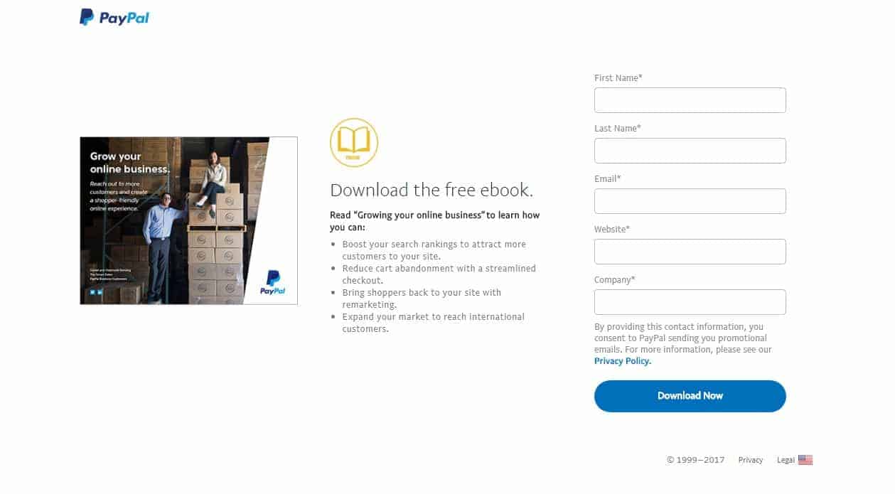
Click To Zoom
PayPal uses bullet points to make the contents of their ebook crystal clear to the reader. Notice how instead of saying that “our ebook contains the following,” it says “here’s what you can expect to learn.” This definitely satisfies WIIFM (“What’s in it for me?”) for the reader.
InsideSales
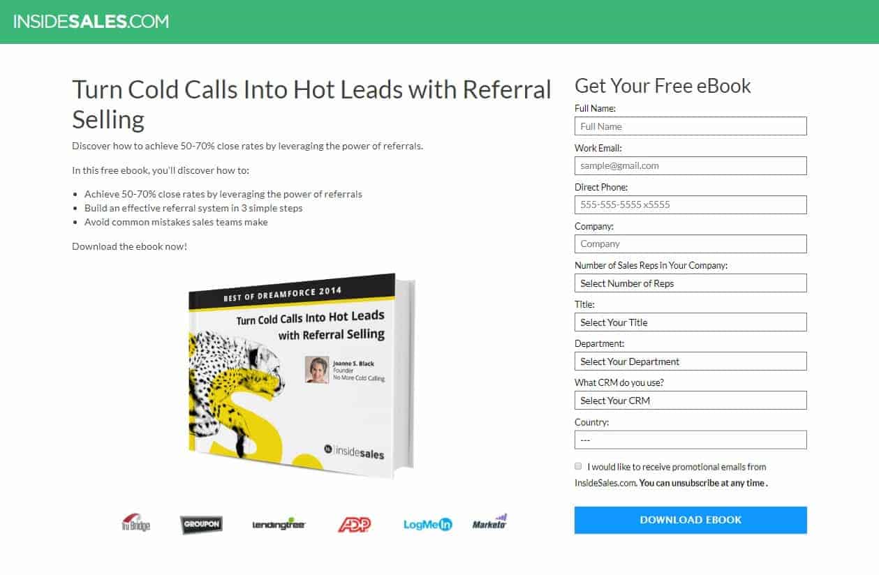
Click To Zoom
InsideSales goes clear and concise with an opening summary (“Discover how to achieve 50-70% close rates by leveraging the power of referrals.”) and then three bullet points with the specific topics that the reader can learn.
Propel Marketing
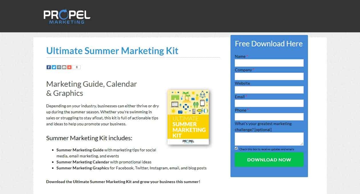
Click To Zoom
The benefits of the kit are apparent in the opening sentences. Notice the usage of boldface as well to emphasize the contents of the kit such that it is entirely clear that the reader will get a guide, a calendar, and graphics.
Visuals affect readers immediately, while your text needs to be read first for it to make an impact. Thus, images are important as they give that extra push for readers to be convinced.
The usual image used here is a hero image, which is the best photograph or graphical image of your lead magnet. However, you can use a video instead if your lead magnet is a physical product so you can show it in action, or if you want to record a screencast of your digital product.
If you’re on the fence about using video, here are some reasons why you need to at least consider using it.
HubSpot x Unbounce
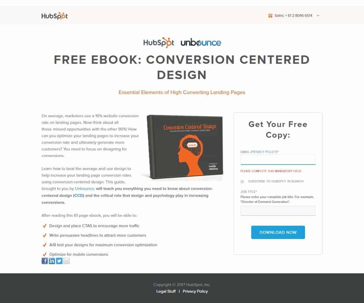
Click To Zoom
This is a great example of an image that is a graphical representation of a digital product, in this case, an ebook. Notice how the title and subtitle of the ebook on the cover match the headline and subheadline of the landing page.
Consulting.com
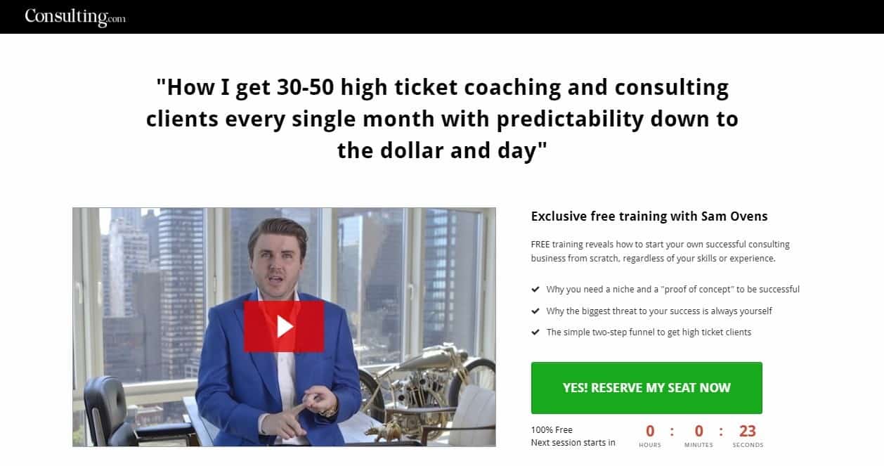
Click To Zoom
The Consulting.com landing page is a good example of how to use video to present free training. Notice how the poster image is of Sam Ovens looking straight at you. His surroundings and even his clothes say “professional” but not that formal as to alienate casual visitors. It’s also in stark contrast to his origin story, in which he was broke and working from his parents’ garage. It’s compelling and holds the viewer’s interest.
Sam Ovens also effectively expounds on the three key benefits that the viewer can expect from his free training. This is a good use of the limited real estate of his landing page. However, this video could have benefitted from a CTA somewhere in the video as well.
The lead capture form is where your visitors input their information so they can get what you’re offering. The main thing to remember when creating your lead capture form is that your visitors won’t give up their information just because you asked for it. You have to convince them to make that final step to converting even while they’re filling out your form.
Generally, you only have to ask for their email address, as well as their first name to personalize your emails, but the more complex your lead magnet, the more justified you are in asking for more information. If you have to use a long form, here are some factors that make your visitors don’t fill out long forms and what you can do about it.
Hindrance: Open-ended questions that people have to ponder.
Solution: Use dropdown menus.
If people have to ponder over your questions and type whole sentences just to get your lead magnet, that’s a quick way to make them decide they don’t want your offer that badly. Make it easier for them to choose one and be done.
Hindrance: Dropdown menus that don’t include a viable option.
Solution: Offer a way out.
Placing an “Other” option or some other catch-all, “etcetera” option minimizes the chances of your visitor becoming frustrated and giving up.
Hindrance: CAPTCHAs are challenging to fill out.
Solution: Install an alternative to CAPTCHAs or don’t use it.
Having to choose between the security of your blog and maximizing signups sucks. CAPTCHAs help you secure your site by making sure the people signing up are actually human. However, those distorted texts that supposedly separate out bots from humans are becoming increasingly difficult for humans to decipher. Also, it’s a big limitation for the visually impaired and dyslexics.
Fortunately, many alternatives to CAPTCHA are now available. So far, the most popular ones seem to be Math Captcha for WordPress users and Google’s reCAPTCHA. The more common approach is to do away with CAPTCHA and just use proper email list hygiene to maintain their email lists and ensure you have no bots in your list. This is more work for you, but if it will increase human signups, it could be worth it.
A good blog needs to have a privacy policy, but the link to it is normally relegated to the footer on your pages. However, when you’re collecting information from your readers, it’s best to alleviate your readers’ fears about giving you their information so they feel secure and more willing to convert. Here are some recommendations when creating your privacy statement in your lead capture form.
iPro Academy
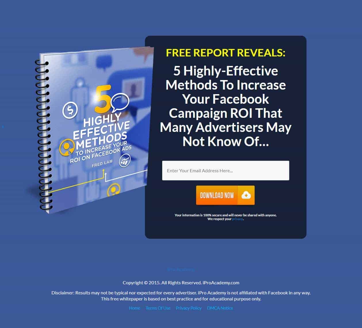
Click To Zoom
This minimalist landing page only asks for an email address and nothing else. It’s actually appropriate because the offer is a brief whitepaper; no doubt valuable but probably not as valuable as an ebook. Notice as well how they did away with the benefits and placed everything the whitepaper is about in their headline.
Salesforce
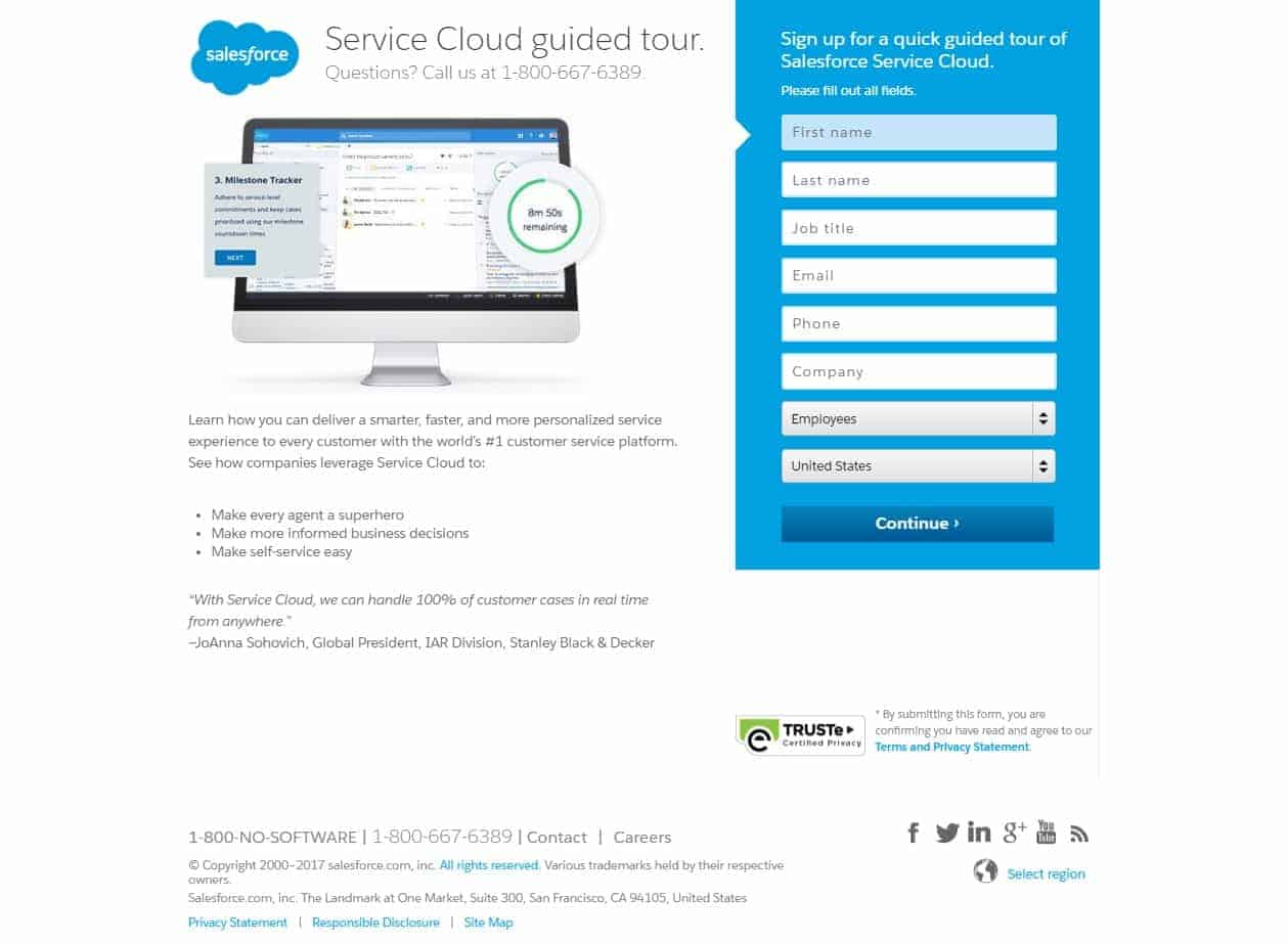
Click To Zoom
The lead capture form for this landing page has 8 fields, which is a tad long, but considering their offer is a guided tour, it justifies asking for more information. Notice how the number of employees and country are in dropdown boxes, which reduces the amount of typing they have to do. Notice as well the TRUSTe (now known as TrustArc) logo plus the nearby link to their privacy policy, which adds trust.
Outskirts Press
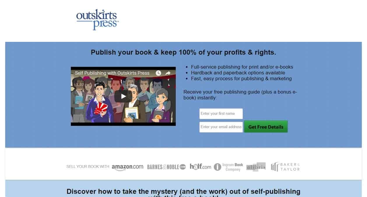
Click To Zoom
Asking for your readers’ name and email address is where you’ll want to start if your lead magnet is a guide + a free ebook, like this one from Outskirts Press. The only things missing here are a privacy statement and a link to their privacy policy.
The entire objective of creating a landing page is getting your readers to click on your CTA. This is the central element that you optimize the rest of your page around.
There are two factors of a CTA that determine how effective it is: copy and design. Here are some pointers when making your CTA.
Note: I’ve discussed CTAs previously, but in different contexts. If you want more information, read my previous posts here and here.
Consulting.com
Click To Zoom
Yes, this again, but this time, look at how the CTA stands out on the page, with its big, green button, text in all caps, and a positive “Yes!” at the beginning. Notice that the font is the same as the rest of the page, so that even if the CTA stands out, it doesn’t look out of place. Plus, they played the urgency card with the “Now” and the countdown timer right below the CTA button.
180fusion
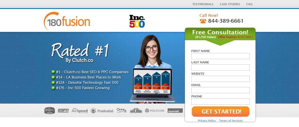
Click To Zoom
Big, orange button plus concise copy make this CTA stand out from the page, even though the rest of the elements look cramped.
Jeff Bullas
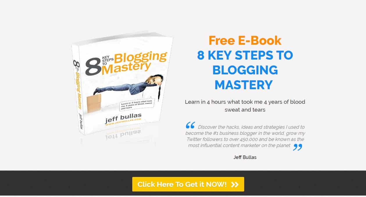
Click To Zoom
The copy is longer than what I would recommend, but notice how the yellow button starkly contrasts with the very dark gray background, as well as the “NOW” that just begs for attention.
People want to know if what you’re offering is actually effective before they get it. This is where social proof comes in.
The social proof theory was popularized by Dr. Robert Cialdini, a psychologist and the author of Influence: The Psychology of Persuasion. So what is social proof? According to Cialdini:
This principle states that we determine what is correct by finding out what other people think is correct.”
Right, but what does this have to do with landing pages?
Your reader is much more likely to convert if they see that other people have downloaded or taken advantage of what you’re offering and declare it to have been helpful to them. When someone makes a statement that your lead magnet has benefitted them or was part of their success, that’s called a testimonial.
Placing testimonials on your landing page reassures hesitant visitors that what you’re offering has value. It increases trust in your lead magnet and that it’s going to help them achieve whatever your lead magnet promises to achieve. To be highly effective, a testimonial needs to resonate with your target audience and the people who can potentially benefit from what you’re offering.
Testimonials and endorsements sound like the same thing, but they do have subtle yet important differences. If you want to use social proof in your landing page, it’s important to be aware of this difference so you can use one or both of them according to your strategy.
Endorsements involve celebrities or famous personalities, or in the case of bloggers, influencers and prominent bloggers in the niche. Their endorsement tells your reader that they believe in your lead magnet. These prominent people in the niche command recognition and trust, which could convince your reader to convert, in theory.
However, they’re less likely to say that your offer improved their life in some way. Plus, any savvy reader would know that the endorsement came at a price, monetary or otherwise, and thus tend to be biased.
Testimonials, by contrast, come from your readers and “ordinary visitors”; that is, they aren’t very famous in your niche. But their statements can help you more because they’re likely to have stories on how your lead magnet solved a problem that they had. There’s a reason why Amazon features user reviews; it’s because their buyers consult them to know if these products really work from people who have no vested interest and therefore not biased.
So which one should you use? It really depends on your niche, target audience, and lead magnet. I would recommend using both if you can, but if you must only use one, I would recommend using testimonials. Real people with real stories are more persuasive and convincing nowadays, especially now that we’re facing a scarcity of authenticity on the internet.
Social proof is certainly a powerful influencing tool, but if you managed to get only a single tweet about your blog, or only 47 subscribers, you might be better off not including this in your landing page. This certainly sounds contradictory (especially since I said this is an essential element), but hear me out.
If social proof manages to make you look unpopular, this can actually work against you, instead of simply being overlooked. How it works is that readers come across your landing page with a single, solitary tweet, and they assume that you aren’t trustworthy, or that no one is reading your blog because it’s awful. Which is unfair, and not always true, but this is all happening at a subconscious level.
So, instead of including that single tweet, focus on playing up the benefits of your lead magnet.
Notice that all the examples have their testimonials after the fold, and some of them even have them near the bottom of the page. This is because if your headline, subheadline, and benefits don’t compel you to convert, social proof most probably will.
Apttus

Click To Zoom
The testimonials are from real people and real users of X-Author. Being prominent people in their respective organizations is a bonus, as their name, organization, and position are easily verifiable. Notice as well that aside from compliments, they included specific ways that X-Author was valuable to their clients.
Flywheel

Click To Zoom
As with Apttus, real people are featured as social proof, and they’re easily verifiable because of the links to their respective websites.
KlientBoost

Click To Zoom
Here, we see another way to display testimonials. Notice that the two testimonials aren’t grouped together, but are broken up by a list of benefits of having more phone leads, as well as a CTA. It’s as if they’re saying “If one testimonial doesn’t convince you, here’s another one.”
Whether you have a single landing page for your mailing list, or planning to make more lead magnets and thus more landing pages, you’ll want to optimize your landing pages so you can get more casual readers and visitors to convert to leads. Here are more tips you can act on to maximize your conversions.
This is key to landing pages. Since there isn’t a standard way to do it, let your readers decide what works best. The only way you’re going to know what truly works is if you test and validate your hypotheses.
I’ll talk about the proper way to test elements of your landing page in a future article, but in a nutshell, you need to test your elements one at a time. If you want to know if tweaking your headline will increase conversion, test that and nothing else. This way, you can be sure that whatever you changed is the only contributing factor to any change in your conversion rates.
All copy in the landing page must be perfect. And I mean perfect. Make sure the grammar is correct and there are no typos. Ensure that the font style and size are consistent, as well as alignment.
Double-check your copy, and then check it again. Have someone else go through it (if you can hire a professional, hire one).
It seems like a lot of work for something that gets glossed over when your readers are browsing through. But spelling and grammar errors decrease trust. A single misplaced apostrophe or a “your versus you’re” mistake can make a huge difference in conversions. After all, you can’t be trusted to write your own copy perfectly, how can you be trusted to provide value?
You won’t be able to know how your landing page is performing if you don’t measure your traffic and your conversions. It’s a good idea to set this up even before you start creating your landing page so you’ll know how your landing page is doing right at the start when you initially launch it.
Message match is how your landing page reinforces the message on the link they clicked to get to your landing page.
If your headline doesn’t reflect the link they clicked, visitors will leave your page. Simple as that. Not only will they will leave, but they’ll have a negative impression. At best, they’ll feel confused. At worst, they’ll think that you pulled a bait-and-switch on them and feel duped.
Matching your headline is a basic but effective way to ensure a seamless experience. You can also match the CTA button and the design. The point is to make your visitors believe that the link they felt compelled to click is for something they are really interested in.
Your blog should already be responsive so that it displays properly on mobile devices. Don’t forget about your landing page.

Visitors shouldn’t have to pinch-zoom to read the benefits of your offer, or scroll way down to find your CTA. You can even tweak your fields such that their keyboards automatically switch to adapt to the input you’re asking for.
Have you noticed how your mobile keyboard changes when you’re inputting a URL on your mobile browser, or typing in an email address on your email app? You can do that on your landing page, too.
Optimizing for mobile devices also means being concise is more important than ever. No matter how short your readers’ attention spans are on their laptop, they’re much shorter on their smartphone.
SEO isn’t a major factor for short-term landing pages, but you’ll want to consider SEO for your landing pages that will be around for a long time, such as the ones for your lead magnets. This should be secondary to optimizing the essential elements of your landing page, but it can’t hurt to think of increasing organic traffic (i.e., traffic coming from search engines) to your landing page.
Just to recap our discussion, Here are the 7 essential elements of a landing page you’ll need to optimize to maximize your conversions.
I hope I gave you some helpful guidelines and ideas on how to make an effective landing page. I just have a few more reminders (or I should say “Don’ts”) before you go on your way.
There’s more than one way to skin a cat, and there’s definitely more than one way to create a landing page.
Every landing page has a different goal, different offering, different target audience, a different niche. So many factors are considered when creating a landing page, as surely you’ve learned from this article. I’ve given you the basics, now it’s up to you to tinker with these elements and combine them into a landing page that works.
At the end of the day, the landing page that converts is the best one.
Your landing page is only as good as your offer.
Before you even start creating your landing page, you need to make sure that what you’re offering is something that your target audience wants. In addition, you’ll want to ensure the quality of your offer. You can probably get away with a low-quality lead magnet for a while, but eventually, you’ll pay the price in the number of unsubscribes and decreased traffic to your blog. You definitely don’t want that.
You promised to help your readers? Fulfill that promise. You’ll only have a successful landing page if what you’re offering provides real value to your readers.
Making landing pages that convert is a skill that you’ll need for as long as you’re blogging. Just as you should never stop building and growing your email list, you should never stop building landing pages.
Plan your landing page. Build it. Test it. Find the best version. Then do it all again.
Have you built your landing page? How was your experience? Tell me about it in the comment section below.
JoAnne is your average, everyday, sane stay-at-home mom who believes in the power of the internet to make dreams come true. She has an insatiable appetite for chocolate, as well as all things internet marketing. She keeps up with the latest trends in blogging, affiliate marketing, e-commerce, and more.
