Menu

First impressions can make or break a sale. Your product detail page is the first thing people see when shopping for a product. In today’s article, I run down some product detail page best practices you can apply to turn your casual visitor into a customer.
First impressions are extremely powerful.
Say a visitor stumbles upon your blog and starts to explore your ecommerce site. They click on a product image to know more about the product, which takes them to the aptly-named product detail page.
Whether they click “Add to Cart” or close the page and browse elsewhere depends on whether the page convinced them to buy the product.
In today’s article, I’m going to give you a rundown of product detail page best practices you can apply to your website so you can convince your customers to buy that product.
A product detail page is where information about a product is presented. It allows customers to see and experience the product for themselves before they decide whether to buy it or not.
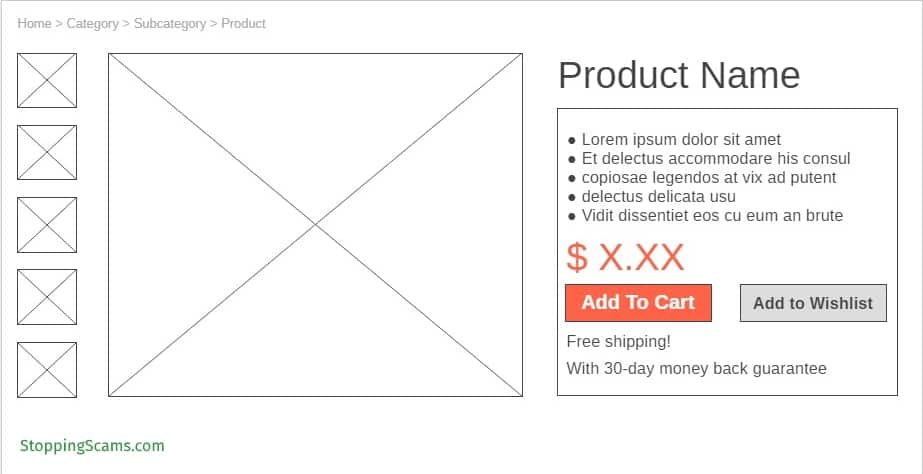
Bare-bones product detail page wireframe
Click To Zoom
The three main purposes of a product detail page are
A product detail page is made up of several components that work together to do its job. Let’s examine them piece by piece so you’ll have a thorough look at what makes a product detail page effective.
Here’s a list of product detail page best practices to convince your visitors to become customers and maximize your conversions.
Content for product detail pages is sometimes overlooked. Don’t make the same mistake. Copywriting for product detail pages should be done excellently for you to successfully sell your product.
Generally, the longer the product name, the better.
Longer product names imply that the product is high-value and attracts visitors’ attention. Plus, it gives the page a greater chance to be found through organic search because of the keywords that will naturally occur in the name.
You want to include descriptive words and phrases in your product name, but you don’t want it to be a full-blown paragraph, especially as this is the headline on your page.
Screenshot from Product Detail Page from Amazon.com
Click To Zoom
The purpose of the product description isn’t to provide a general description of the product; you have the product image for that. The point of a product description is to provide the most important features and benefits at a glance and establish a strong case for why your customer should buy your product.
Your product description should be short, well-written, and descriptive. Don’t worry too much about plugging in keywords here because this isn’t a blog post.
Here are some pointers to write convincing product descriptions:
Speak to your customer in their language. You’ll want to speak to your target customer using language that will resonate with them and catch their attention.
You don’t want to be too technical here or too “sales-y”; you want them to feel like it’s someone they like and trust who’s telling them about this product and how it can help them. Don’t be afraid to use your usual writing voice and use personality and humor to win them over.
Use formatting wisely. Bullet points are good here so that it’s easy for customers to scan. Draw their attention to important benefits by using boldface and italics.
Answer questions your customers will likely have. If you know your customers well enough, then you should have an idea of what questions they’ll have about your product. Do your best to answer them before they’re even asked.
Overcome objections. Similar to questions about your product, your customers will likely have a point of objection or two. If you can overcome objections head-on at this point, you’ll be more likely to move customers toward the “Add to Cart” button.
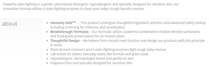
Screenshot from product detail page from Honest.com
Click To Zoom
The look and feel of the page is a huge factor in whether your customer will stay on the page and buy from you, or just skip out without looking back. Consider the appearance of your page when designing it.
I mean, will you really buy something you haven’t even seen?
In the absence of a physical store, product images are really all you have to show your customers what your product looks like. It also increases their confidence that what you’re describing is really what you’re selling.
Here are some image attributes that matter.
Size A large hero image is striking and provides visual confirmation to your customers that they’re in the right place.
Small images also have a negative impact on your customers. Displaying only tiny images takes away from your credibility as a seller.
Resolution High-quality images look good everywhere; from a smartphone to a high-resolution display on a laptop. Plus, this enables your customers to zoom into your photo and look at it in greater detail without the image getting pixelated.
Zoom Speaking of zooming in, play around with different options to zoom into your product image. Whether it’s “click to enlarge” or “hover to zoom in”, allow customers a closer look at your product than you normally give.
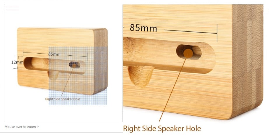
Screenshot from product detail page from TOMTOP.com
Click To Zoom
Number The more images available for a product, the better. The idea is that the more details your customers see, the more informed the decision they’re going to make.
Be strategic here, though; 20 photos of your product with the same view won’t be helpful to your customers.
If your product comes in many colors, display an image for every color it comes in, if possible. It doesn’t do much except to answer the question, “I wonder how it looks like in pink?” but appearance could be a make or break for some of your customers.

Screenshot from product detail page from TOMTOP.com. Note that there are five images for this product that take the place of the hero shot of the product when clicked.
Click To Zoom
Take photos of the product from as many viewpoints and angles as possible. More information is always a good thing when it comes to purchase decisions.
Context Including photos of the product as it’s being used is a bonus point for you, especially if the product is a fashion item or its use isn’t intuitive. This allows them to visualize themselves using the product as well.
Product photos are great, but embedding a video in your product page can provide more context and information to your customers than photographs ever can. It’s the closest thing they’ll ever get to an actual demonstration of how the product is used, and help show customers how to use a product that may be complicated.
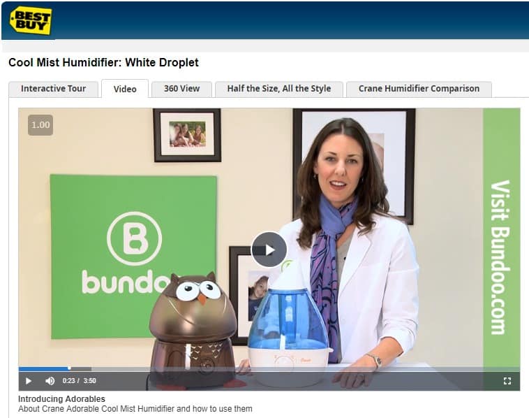
Screenshot from product detail page from BestBuy.com
Click To Zoom
You can include a product demonstration video, a tutorial video, or a tips and suggestions video. Either way, showcase the product and how to use it properly to get the most out of it.
As more and more people use their mobile phones to browse the internet, they also use their mobile phones to shop for products online.
When it comes to ecommerce, it isn’t enough that your theme is mobile responsive. You also need to design the elements on the page such that customers using their mobile phones find your site easy to order from. Here are some design tips for your mobile customers.
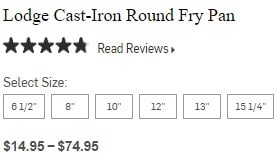
Avoid using dropdown menus whenever possible. Dropdown menus are sometimes used when there are a number of variations available for the product.
A better option is to present them as buttons so that they’re tap-friendly.
Screenshot from product detail page from williams-sonoma.com.
Click To Zoom
Use expand-and-collapse menus instead of tabbed content. This type of menu is more convenient for those who have limited screen sizes because the choice to read long text is left up to them. They simply need to tap on each menu item if they want to find out more, or not if they don’t want to.
Use icons to highlight important content. Using icons when appropriate can free up space and reduce the need for mobile users to scroll down.
Screenshot from product detail page from ASOS.com. Note the clock icon to denote low stock, the hanger-with-ruler icon to denote popular sizes, and the heart icon to denote the wishlist.
Click To Zoom
A call to action (CTA) tells your customer exactly what you want them to do next. For a product detail page, the action you want your customers to do here is to buy the item or add it to their cart.
I’ve discussed CTAs for blog posts previously, but CTAs on product detail pages are more high-stakes than those, so you’d do well to pay special attention to the CTA on your product detail page.
“Add to cart” versus “Add to my cart.” “Buy” versus “Buy now.”
These seem like minor differences, but these minor differences can have a huge influence on your customer’s decision to buy the product. Here are some CTA principles to bear in mind.
Ownership. Suggesting that something is already theirs can be powerful enough to convince them to click that button. Pronouns implying ownership (“my,” “mine,” “your,” “yours”) help in this regard.
Familiarity. Too much innovation can sometimes work against you instead of help your CTA get clicks. Stick to the basics (i.e., what customers expect) and tweak them instead of doing a complete overhaul.
Screenshot from product detail page from Amazon.com
Click To Zoom
For example, “Add to cart” and minor variations like “Add to my cart” or “Add to basket” are phrases that customers have come to expect from expected online stores. Being clever and using phrases like “pick it up” or “get awesome” will only confuse them.
Urgency. It’s in our nature to place more value on products that are only available for a limited time. You want to make your readers feel the urgency and compel them to take action right now.
Test using words like “today” and “now” to inspire your customers to click.
The most important thing about your button is for it to be seen and stand out against all the other elements in the page. Button colors are a factor, but it’s not the most important factor. As long as it is a contrasting color from the background and it is consistent with the other colors on your blog, you should be fine.
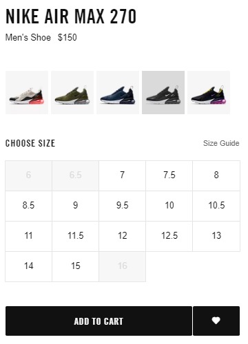
Screenshot from product detail page from Nike.com
Click To Zoom
Another thing to consider is the size. You want to use a big one such that your customers’ eyes are drawn to it, but not too big to be distracting.
Speaking of distractions, you generally don’t want your customers to be distracted too much from the main action you want them to do on your page, which is to actually buy the product.
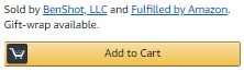
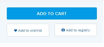
Some online stores have share buttons on their product pages for customers to share items. You generally don’t want this, because clicking these share buttons take them elsewhere and distracts them from completing the action.
If you feel you must provide a secondary action for your customers, opt to place an “add to wishlist” or “add to favorites” secondary button that doesn’t require them to go to another page to complete the action. Opt for a lightbox or a small pop-up message confirming that the product has been added to their wishlist so that they stay on the page.
Screenshot from product detail page from www.ContainerStore.com
Click To Zoom
Making your customers aware that you’re offering other products increases the chances for either additional sales on items or additional profit from selling a higher-value item. But it’s not all about you.
Your customers benefit from having everything they need to use the product, and they benefit from seeing other choices for their product that may be better suited to their needs.
Cross selling is the act of offering related or complementary products to customers. For example, if you’re selling a guitar, you might want to offer a guitar pick, a capo, or a guitar case.
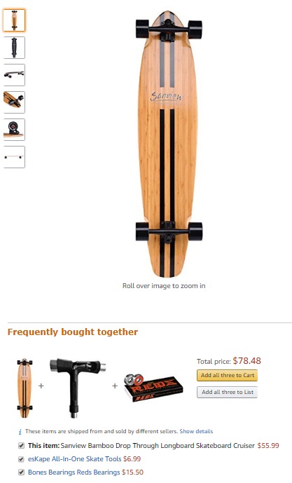
Screenshot from product detail page from Amazon.com. Note the “Frequently bought together” section below the main item.
Click To Zoom
This is a good way to show your customers that your product offerings are comprehensive and that you’ve thoughtfully curated these products to meet your customers’ needs.
The technique here is to show customers the products that they would purchase anyway; if not now, in the future. You’re just saving them time and clicks by showing them these products on the detail page of the main product.
Screenshot from product detail page from Honest.com. Offering bundled products is another way to cross sell.
Click To Zoom
Upselling is different from cross selling in that instead of offering complementary products, you’re offering products that are similar to the main product but more expensive. Thus, it’s trying to make them spend more on the same product or product type.
This is not about tricking your customers; it’s making them aware that there are other options that may be more expensive that will give them more benefits and may be a better fit for them.
Presenting your customers with choices shows that you have a wide range of products for different needs and budgets.
Screenshot from product detail page from eBay.com
Click To Zoom
If customers don’t trust you or your site, they won’t buy from you. Give people proof of your credibility so they’ll trust you enough to buy from your site.
Having trust badges is a sign of being a trustworthy merchant running a safe site. Examples of trust badges that inspire trust in customers include trust badges from computer protection companies such as Norton and McAfee.
Other trust badges that can inspire trust include logos of your accepted payment methods (e.g., Visa, Mastercard, PayPal) and third-party trust badges (e.g., Better Business Bureau, Google certified shop).
Screenshot from product detail page from TOMTOP.com
Click To Zoom
Having a return policy in place signifies that you absolutely stand by your product, which increases their confidence to buy from you.
However, returns can be tricky when dealing with online stores and especially when the products are dropshipped.
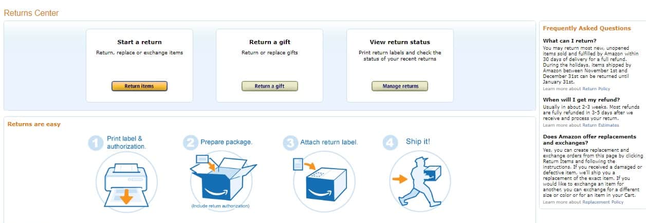
Screenshot from returns page from Amazon.com. Note the streamlined return process and the clear return policy.
Click To Zoom
Be absolutely clear about how long they have to return a product, who will cover the shipping charges, and if you’re going to replace defective items. If it’s too long or wordy, you can display a link that will show them a pop-up or a lightbox with complete details on your return policy.
Before purchasing a product, reviews from other buyers are one of the things that customers look for. Make sure to ask all of the customers who do buy the product to review it, and display the reviews on the product detail page.
Encourage your customers to be honest. Positive reviews are awesome, but negative reviews should be addressed. When customers see that you accept negative reviews gracefully and attempt to correct whatever went wrong, that gives them a positive impression of you.
Reward customers for speaking out. Detailed product reviews take time to type out, and giving them an incentive could inspire them to go this extra mile to help other customers to make informed decisions on their purchases.
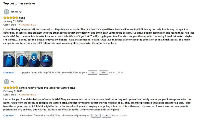
Screenshot from product detail page from Amazon.com
Click To Zoom
When going into dropshipping, or ecommerce in general, there are plenty of things that are out of your control. Your products may be out of stock, or deliveries may hit snags. However, if you do your best to provide a positive user experience, you’ll still be able to convince customers that your site is a good place to shop.
How long the page loads is a real concern, especially when the page is a bit heavy on the visuals.
Research how to minimize the loading time for your product detail pages, or better yet, work with a developer to make sure that customers aren’t looking at the “Loading” logo when they’d rather look at product images.
Good customer service can sway your customers’ purchase decision as well. They’d rather buy from a store that provides various channels for support (i.e., phone or email) and reassures them that they’re valued as customers.
Larger online stores have a live chat feature so that any questions by their customers get addressed almost instantly. If you’re dropshipping all by yourself, you might not have the manpower to handle this feature.
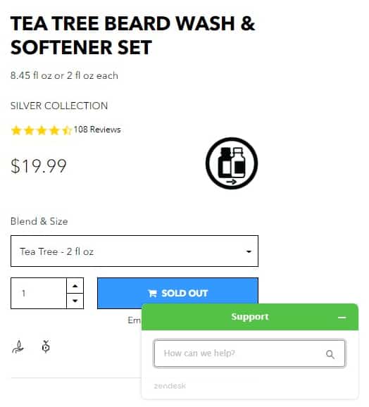
Screenshot from product detail page from Beardbrand.com. Note the live chat feature on the bottom right corner of the page.
Click To Zoom
The next best thing would be a feature to at least leave a message for you right on the product page so they don’t forget their question while going to another page to email you or write it on your Contact page.
Good after-sales support is also part of excellent customer service. Be ready to answer queries even after the purchase is completed.
Your customer might like your product and is thinking about buying it, but may not be ready to purchase right this second.
Having a wishlist feature on your product detail page can help them go back to the product they’re interested in later, when they’re actually ready to go through with the purchase. Offering this feature saves them time because their favorite products are stored and ready to place in the cart whenever they’re ready to buy them.
Screenshot from product detail page from Zappos.com
Click To Zoom
An added benefit for you is that you can track which products are being placed in wishlists. From the data you gather, you can figure out which products are in demand. You can also use this data to send targeted promotional emails to your customers with similar products they might be interested in.
If you make it easy for your customers to browse and shop on your online store, they’re more likely to go through with their purchase and more likely to recommend your online store to others. Here are some tips to improve the usability of your product detail page.
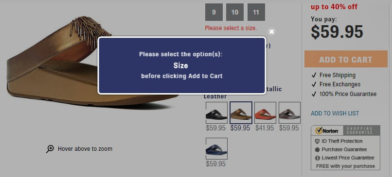
Don’t specify a default value if a product has a number of variants. For example, if an item is available in different colors, don’t specify a default color. Chances are some careless customers will add the item to their cart without realizing they haven’t selected the color they really want.
Display error messages when customers add items to their cart when they haven’t selected options. This feature is still part of making sure that your customers get the item that they are expecting. Remind your customers if they have to specify a color and a size, for example, before adding the item to their cart.
Screenshot from product detail page from Shoes.com
Click To Zoom
Aside from the above components, there are other factors that influence customers’ purchase decisions. Do your best to tweak what you can to nudge your customers to make that purchase.
Stating the obvious here, but the price of the product should be displayed prominently. Experiment with displaying it in a larger font than the text in the background or placing plenty of white space around it.
If you’re offering a discount, show the prices before the discount and after the discount. If you can also display the price difference, that’s even better.
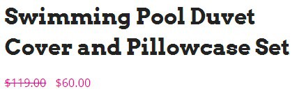
Screenshot from product detail page from Colossalshop.com
Click To Zoom
Knowing how much they’ll save could possibly inspire customers to take action, especially if the discount is a limited-time offer.
Customers don’t like wasting their time ordering something that’s not in stock.
Can you imagine going through the checkout process (i.e., entering your credit card and shipping information) only to find out at the last step that the item you want isn’t available?
What a bummer, am I right?
Indicate if the item is in stock right as they’re looking at the product details. That way, they’ll still have a chance to look at other alternatives before they go through the entire process of buying it.
It’s also helpful to keep a running countdown when you only have a few units of the product left. It’s best to phrase it so that it triggers customers’ fear of missing out.
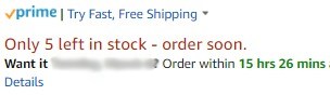
Screenshot from product detail page from Amazon.com
Click To Zoom
People hate losing or missing out on things; sometimes even more than they love getting stuff. Few things make one’s heart skip a beat better than reading “Only 1 left!”
Customers don’t want to be surprised by shipping charges and delivery times during checkout. Make these clear on the product detail page and don’t leave it until the last minute.
If your supplier is based in another country, delivery times may take a couple of weeks or even longer; expedited shipping may be available but it may cost your customers, so be clear about this upfront.
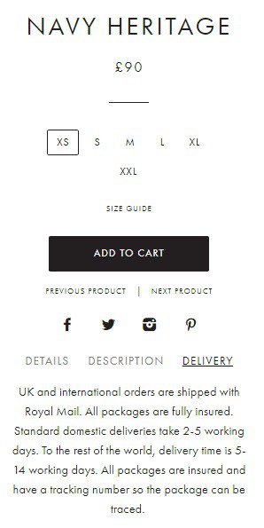
Screenshot from product detail page from Svelte.co.uk
Click To Zoom
Let me recap the product detail page factors you need to focus on and apply best practices:
Here are a couple more product detail page best practices to keep in mind:
These best practices aren’t set in stone; they’re more like guidelines based on successful ecommerce sites and what worked for them.
That doesn’t ALWAYS mean they’ll work for your site and your visitors.
Do A/B testing on your product detail pages to know what will actually work.
You may appreciate different things from your target audience when it comes to product details.
However, one thing that every shopper likes is to feel like the place they’re buying from values their business.
Treat your customers the way you want to be treated when you shop online, and they will reward you for it.
What did you think about these best practices? Which ones do you think will work for you and which ones won’t? Talk to me in the comments!
JoAnne is your average, everyday, sane stay-at-home mom who believes in the power of the internet to make dreams come true. She has an insatiable appetite for chocolate, as well as all things internet marketing. She keeps up with the latest trends in blogging, affiliate marketing, e-commerce, and more.
