Menu

List building can’t be accomplished without opt-in forms, and thus, every self-respecting blogger has at least one of them in their blog. However, not all opt-in forms are created equal. Some are more effective than others, and unfortunately, many are downright annoying. Today, I list down 7 opt-in form design techniques that will help you convert your visitors into subscribers.
If you’re serious about monetizing your blog, you should have a list building strategy in place, and that includes inviting blog readers to subscribe to your email list.
Opt-in forms are essential to any list building strategy, and thus, it’s absolutely important that you nail every aspect.
As the first thing that people see, the design of your opt-in form needs to catch attention, communicate the value of your lead magnet, and compel readers to sign up for your mailing list.
In today’s blog post, I run down some opt-in form design techniques to help you convert more visitors from casual readers to serious subscribers.
Before you even start designing your opt-in forms, you should know which ones to use in your website and where you should use them.
Here are the different types of opt-in forms you can use, along with where and when you should use them on your website.
Fullscreen Welcome Mat. The minute a visitor lands on your page, you can already get their attention through a fullscreen opt-in form with a prominent call to action (CTA) targeted at those who you want to subscribe to your site.
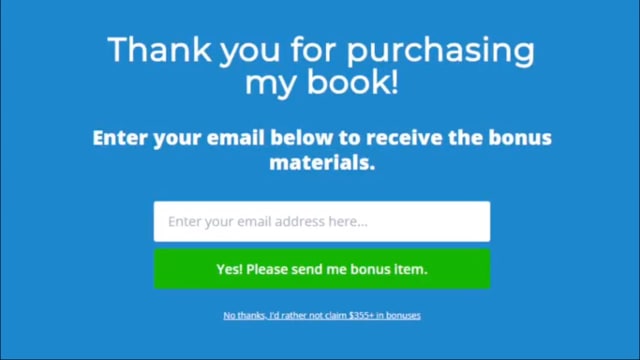
Fullscreen Welcome Mat (Click To Zoom)
You need to be careful here, though; traditional pop-ups and page redirects are bad for SEO and more importantly, for customer experience. Go with a design that displays your form without having to redirect your visitor or worse, triggering the pop-up blockers present in most browsers.
Sidebar Forms. This is the most widespread opt-in form in use, partly because users are almost used to seeing a sidebar opt-in form and partly because this is an opt-in form you can place in all your pages (except possibly your homepage).
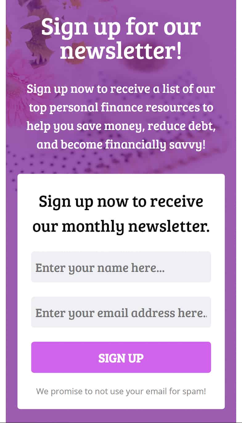
Sidebar Opt-in Form (Click To Zoom)
Slide-in Scroll Box. A scroll box that slides in at the corner of the page, usually at bottom right corner, is a more subtle way to get your visitors’ attention without being too aggressive.
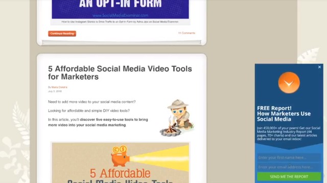
Sidebar Opt-in Form (Click To Zoom)
The usual time these boxes slide into view is when your visitors are in the middle of the page or article they’re reading.
Floating Bar. Another unobtrusive way to get signups is to put a floating bar on the header, footer, or both. In the example below, the floating bar is at the footer with a CTA “Learn more.”

Floating Bar (Click To Zoom)
Inline Forms. These are forms interspersed in the articles your visitors are reading, which are effective in converting when your readers are already engaged with your content.

Inline Form (Click To Zoom)
Content Locker. Locking content involves cropping or blurring out content below a certain point on the page such that visitors have to opt in to read the whole blog post or article.

Content Locker (Click To Zoom)
It’s probably not advisable to do this for all your content, though, as this will just turn off readers and increase your bounce rate (i.e., the rate at which visitors close the tab or skip away to another page. Reserve content lockers for your high-value content to make opting in worth their while.
Lightbox pop-up. A lightbox pop-up is a form that appears on the foreground of the webpage you’re viewing. When it appears, the webpage is darkened in the background, highlighting the form. It’s different from conventional pop-ups in that it’s not a new window and thus doesn’t set off your browser’s pop-up blockers.

Lightbox Popup (Click To Zoom)
The particular type of opt-in form you use depends on what particular campaign you’re running; whether it’s a generic invitation for your readers to subscribe to your mailing list, or if you have a time-sensitive offer or sale, or if you want to promote a contest or challenge on your website.
It is recommended to have at least 2 opt-in forms in use on your website at any given time. They can be for separate campaigns or for the same campaign; the important thing is to put opt-in forms in all the right places.
Using the perfect type of opt-in form wouldn’t mean squat if your visitors don’t notice it, or worse, are completely appalled by it. Your opt-in form should be designed such that it commands positive attention.
Here are some tips for making your opt-in form positively irresistible.
Use colors and shapes purposefully. Using colors that contrast with your blog background will make your opt-in form stand out from all the other elements on the page.
Similarly, shapes other than the usual squares and rectangles will make your opt-in form look distinct and can even be used as directional cues to your CTA.

You can experiment with different shapes for your headers.
Depending on the action you want your visitor to take or the message in your copy, you can also use distinctive shapes to catch visitors’ attention. For instance, a red hexagon is reminiscent of a stop sign, while a green circle means “go.”
Color harmony within the opt-in form is as important as the color contrast of your opt-in form with the website background. If your color combinations are jarring, your opt-in form would look unpleasant and thus, unprofessional.
If you need help creating color palettes to use in your opt-in form, check out Adobe Color CC or Paletton to visualize and customize your color palettes.
Emphasize important words. Experiment with using all caps, boldface, italics, a different font color, or a larger font size to emphasize words that are significant to your visitors. This only works, though, if you’re highlighting very few words and if your copy isn’t very long.
Use the right fonts. Your copy may be punchy, but to get it read by your visitors, you need to use the right font and font combinations.

For instance, this font may look good for display purposes but won’t be effective in an opt-in form.
The font you use for your opt-in forms should be the same as, or at least complements, the font you’re using for your entire website. If you’re no graphic designer and have no idea what fonts look good together, the sites
100 Days of Fonts and Google Web Fonts Typographic Project can give you an idea. These sites only use Google fonts, but you can definitely get inspiration whether you use them too or not.
Readers don’t like seeing cluttered, text-heavy forms with plenty of fields to fill out. They’re almost always going to skip subscribing.
The less effort users must exert in reading and comprehending text as well as typing out their information, the more likely they are to complete the process. Here are a few tips to simplify your opt-in form.
Limit the number of form fields. The fewer fields your visitors have to type into, the more likely they are to follow through with the subscription.

Don’t ask too many questions.
The only information you really need for them to subscribe is the email address they want to receive your emails in, as well as their name only for personalization. You don’t even need their full name or even their real first name; their nickname or whatever they want to get called should be enough.
You might feel you have to ask more than their name and email address, particularly if you’re offering a free consultation or something similar in exchange for their subscription to your list. In this case, you can always ask for additional information after they’ve subscribed.
Make it easy to see the fields. Display very clearly where your visitors should enter their information. Ideally, labels for fields are best placed inside the fields themselves. Also, stick to a single-column format to reduce confusion. Don’t waste their time by making them read error messages and correct their input.
Be as concise as you can with your copy. It’s a form, not an essay. Showing your visitors a wall of text won’t inspire them to convert. Study how to say what you need to say in as few words as you can.
This is certainly challenging, as you have to describe what you’re offering to your readers, how it benefits them, and assure them that whatever you’re offering is risk-free. It’s an art, but it’s an art you can definitely learn.
It can be argued that your CTA is the most important section of your opt-in form, as everything on your opt-in form is to get visitors to click on this button. The thing is, no matter how well you designed your opt-in form is, your readers won’t convert if your CTA isn’t convincing enough.

Here are some tips to make your CTA work.
Use strong action words in your copy. You want to inspire your readers to take action, so use verbs. Here are some verbs you might consider using:
Different words will work for different audiences, but in general, the words “Submit” and “Send,” especially when used by themselves, have proven to be ineffective, so avoid using them as much as possible.
Evoke a sense of urgency. Not only do you want to inspire your readers to take action, you want them to take action NOW. Use words such as:
Contrast the button color with your opt-in form. As I’ve mentioned, your opt-in form should already be contrasting with your website background. In turn, your CTA button should be contrasting with your opt-in form.

Click To Zoom
See, the actual color of your CTA button doesn’t matter as much as how well it contrasts with its background. An exception to this rule is the color gray. Never choose gray as your CTA button color because gray buttons are associated with the negative action, such as exiting a window or canceling a process.
The size of the button matters. You definitely want your CTA button to be noticed, and you want readers to be able to read the copy, but you don’t want the button to overpower everything else on the opt-in form or even on the page.
It’s a bit of a Goldilocks situation (e.g., not too little, not too big, just right) and it’s going to take some testing to find the right button size.
Images and photos can do a lot for your opt-in form to be noticed by your visitors, but not just any image will do.
For an image to work effectively with your opt-in form, it has to:
Draw your readers’ eyes to the opt-in form.
If you’re including an image of a person/persons, their line of sight (i.e., the direction they’re looking at) should be right where your opt-in form is.
Why?
The urge to follow someone’s gaze is powerful yet imperceptible; we don’t even know that we’re doing it.

Pointing to your opt-in form may be overkill, but it does the job.
Make sure to use this type of photo and not photos of people staring straight at the camera or worse, looking away from your opt-in form.
If you can’t find relevant photos of people to place on your form, you can make use of arrows, lines, or frames instead to direct your readers’ eyes toward your opt-in form. These directional cues may not be as powerful as the human gaze but are still pretty compelling.

Be applicable to the opt-in form or to your lead magnet.
Opt-in forms that offer lead magnets such as checklists, eBooks, and other digital documents usually include a digital rendering of their lead magnet.

For instance, if you were offering a free eBook on WordPress, you could include an image like this in your opt-in form.
Placing an image in your opt-in form that looks nice but isn’t related in any way to your offer or doesn’t add anything to the customer experience will only end up confusing your visitors and turn them off from signing up for your mailing list.
Evoke the right emotions.
Aside from being applicable to what you’re offering to visitors who sign up, the image should also match whatever emotion you want them to feel such that they’re inspired to sign up for your mailing list.
Examples of these emotions are desire (as in wanting something of value), urgency (as in wanting something NOW), loss (as in losing out on something valuable), fear (as in fear of failure or not accomplishing something), or time (as in saving time).
Be high-quality.
You may be tempted to shoot some photos yourself using your smartphone, but unless you’re a professional yourself, you’re better off springing for professional photos or digital images.
Depending on the tool you use to build your opt-in forms, you can choose when your opt-in form is displayed to your visitors. A perfectly timed display of an opt-in form can boost your conversion rate. Bear in mind, though, that this only works for certain types of opt-in forms, such as floating bars, slide-in box, and your lightbox pop-ups.
Here are some actions that you can use to trigger your opt-in forms.
Exit intent. When a visitor moves their mouse outside the browser window to close the tab, enter another URL, or hit Back, that’s considered an exit intent.
The problem is, most visitors who leave your website will never come back. Thus, visitors who are intending to leave are the visitors you’ll want to nudge before they go to another page or do something else.
In this strategy, you’ll want to use a lightbox pop-up that displays upon your visitors’ exit intent; that is, when they move their mouse toward the close button on their browser.
Remember, this is your last chance to ask them to opt in before they leave your site (possibly forever), so make the most of this opportunity.
Time on page. You can also use how long a visitor has been on your page to determine when to display a pop-up or a floating bar.

Typically, you want to wait at least 10 to 15 seconds for readers to read or at least skim through the content on the page first before you invite them to subscribe.
The problem with showing your opt-in form after a certain period of time is that you aren’t really sure that your visitor is reading.
They might have taken a quick break to look at another window or another program, or they may have left their desk to get a cup of coffee. Coming back to an opt-in form instead of your content may confuse them or worse, turn them off.
Thus, what might be a good compromise is to use a time trigger to display a floating bar, and then use another trigger to display a lightbox pop-up that tends to take over the page.
Visitor activity. Actual visitor activity on the page is a better indication that they are engaging with your content. You can trigger your opt-in form to display when your visitor clicks any element on the page; an image, text, or even blank space on the page.
You can also prompt your opt-in page when your visitors click on a link, but it can potentially be confusing if your visitors are expecting to go elsewhere and they’re shown an opt-in form instead.
Another visitor activity that signals engagement is when they scroll down on the page, which means they’re presumably reading. After your visitors have gone down 50% to 75% of the way down your content, you can assume they’re interested in your content and are more ready to opt in. Triggering a pop-up opt-in form at this point will maximize the chances of them subscribing.
No matter how your visitors access your page, you need to be able to give them a great experience. This goes for the opt-in forms you show them as well.
Most opt-in form tools are able to display different opt-in forms depending on the device. With smartphone users steadily increasing in number, it’s only wise to design opt-in forms that are optimized for mobile device users.

Here are some tips for designing mobile opt-in forms for your website.
Familiarize yourself with the Google penalty for mobile pop-ups. Chances are your visitors came from Google search results, so we do have to play nice with them.
According to an announcement on Google’s blog some time ago, they’ve started penalizing pages that feature pop-ups that are “intrusive”—that is, covering the main content, hard to close, or anything else that makes the content that the searcher intended to consume difficult to access.
Of course, Google’s algorithms are rarely simple, so I recommend reading their webmaster forums and other forums, such as Quora, to know more.
Make sure your website on the whole is mobile-friendly. If your site isn’t mobile-friendly to begin with, your visitor won’t stick around long enough to see your opt-in form.
Be even more concise than you already are. If being brief is important in your usual opt-in forms, it’s even more important in your mobile opt-ins, considering the smaller screen space. Keep this in mind every time you write copy and compose the CTA of your mobile opt-ins.
Choose the type of form wisely. Again, because you have limited space and should prioritize showing your content over anything else, choose opt-in forms that won’t cover the main content. For instance, favor floating bars and inline opt-ins as opposed to pop-ups and slide-in boxes.
Opt-in forms are critical to the success of your list building strategy, and opt-in form design is a crucial factor to how well your opt-in form converts. Hopefully, the techniques I discussed today help you design your opt-in forms for success.
Here’s a recap of the opt-in form design techniques I listed down.
And one last reminder before you work on your opt-in form.
No matter how many studies are done on various audiences, you’ll never know what your particular audience will like and won’t like unless you experiment. Over time, you’ll learn plenty about how to maximize conversions for your audience.
Every time you design a new opt-in form or make changes on your existing forms, always test it and see if what you’re planning to implement does anything for your conversion rates.
Have you been paying attention to building your email list? Are these techniques helpful to your strategy? Can you share some of your own tips for designing opt-in forms that convert? Tell us about them in the comments!
JoAnne is your average, everyday, sane stay-at-home mom who believes in the power of the internet to make dreams come true. She has an insatiable appetite for chocolate, as well as all things internet marketing. She keeps up with the latest trends in blogging, affiliate marketing, e-commerce, and more.
